Design is a conversation between text and visuals, where fonts are the voice of your message. Mastering the art of font pairing is essential for any designer looking to create harmony and impact. Here are ten essential tips to help you navigate the complex world of typography and enhance your design projects.
1. Establish a Hierarchy
The foundation of effective font pairing is establishing a clear hierarchy. Use a bold, attention-grabbing font for your headlines and a simpler, more readable font for body text. This contrast guides the reader’s eye and creates a dynamic visual landscape.

2. Contrast, Don’t Clash
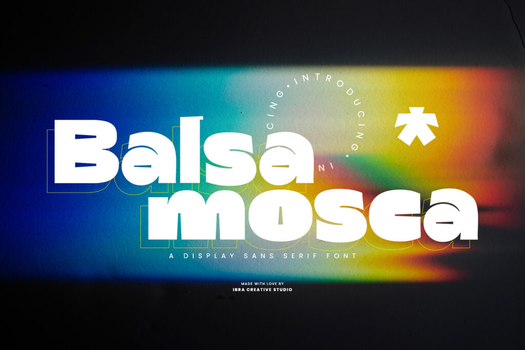
Select fonts with distinct personalities that complement rather than compete with each other. A strong display font can work well with a neutral sans-serif, ensuring that neither overwhelms the other.

3. Understand Font Families
Many font families come with a variety of weights and styles. Staying within the same family for your pairings can guarantee compatibility while allowing you to play with different weights and italics for contrast.
4. Opposites Attract
Mix and match different font types—combine a serif with a sans-serif to create interest. The traditional feel of serifs pairs nicely with the clean lines of sans-serif fonts, offering a balanced aesthetic.

5. Consider Context
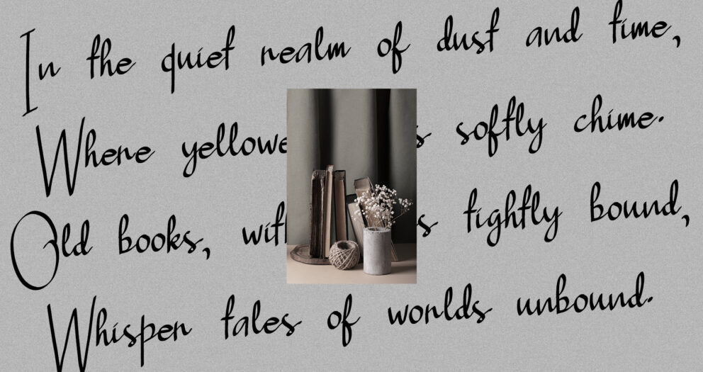
The context of your design should inform your font pairing. A tech startup’s website might benefit from sleek, modern sans-serifs, while a vintage poster might call for a serif with more character and history.

6. Keep it Simple
Simplicity is key. As a general rule, avoid using more than three different fonts in a single design to prevent visual confusion and maintain cohesiveness.
7. Complementary Moods
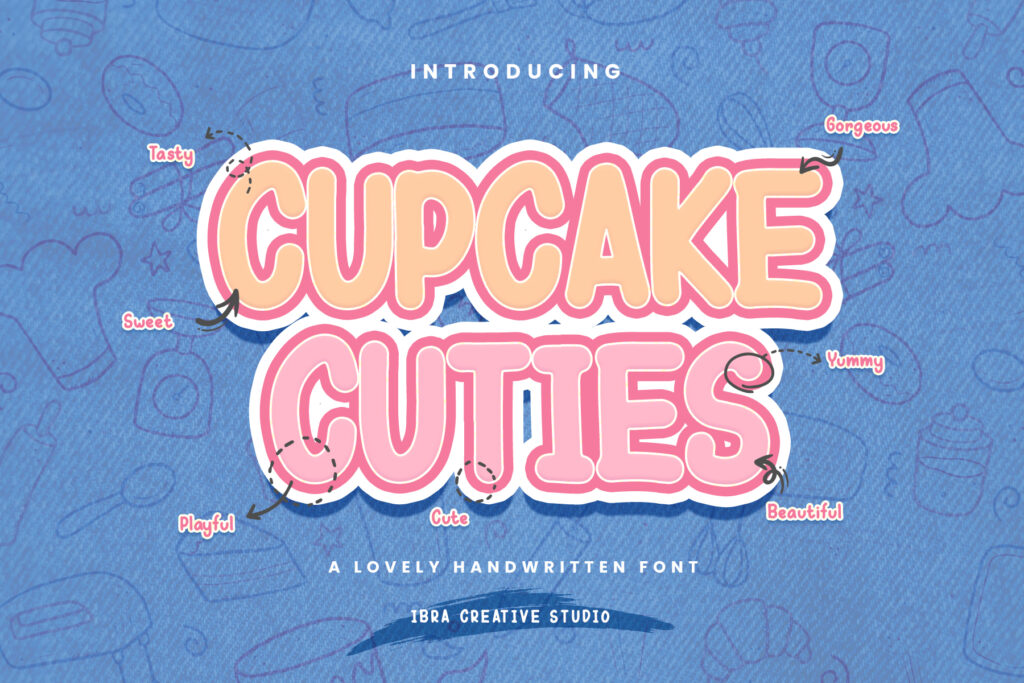
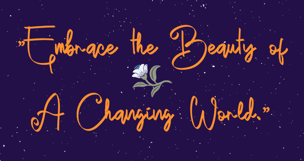
Fonts carry emotion and tone. Ensure your font pairings reflect the mood of your content. A playful script font won’t pair well with a rigid, corporate sans-serif if your design is for a children’s party invitation.

8. Size Matters
When pairing fonts, consider the size of each. A delicate serif might get lost next to a robust sans-serif when used at the same size. Adjusting sizes can help maintain balance and readability.
9. Color and Texture
Color and texture can be used to create additional layers of contrast between your font pairings. Light and dark, bold and thin, textured and smooth—these variations can make your pairings stand out.

10. Practice and Experiment
Like any skill, font pairing improves with practice. Experiment with different combinations, even those that seem unconventional. The more you try, the better your intuition for what works together.
Conclusion
Mastering the art of font pairing is like a dance. Each element must be in sync, complementing each other’s movements to create a piece that is compelling and beautiful. By following these tips, you can enhance the visual storytelling of your designs and communicate with clarity and style. Remember, the best font pairings are those that achieve the intended impact on the audience while maintaining functionality and aesthetic appeal.


