Introduction
Hey there, K-Pop fans! Let’s talk about something that might not be the first thing you notice about your favorite bands but is super important – the fonts they use. Yep, that’s right! From Blackpink’s edgy style to the cute fonts of Twice, the choice of letters is almost as catchy as the tunes themselves. So, let’s dive into the fun and fabulous world of K-Pop typography!
Blackpink’s Signature Style
Bold, Beautiful, and Oh-So Blackpink
Ever noticed how Blackpink’s logo and album titles make you feel like you’re part of something cool and edgy? That’s not by accident. Their sharp, sleek fonts scream confidence and power. It’s like the letters are dancing to the beat of their songs. Unfortunately, the exact names of these custom fonts aren’t typically disclosed, but they sure do match Blackpink’s fierce and fashionable image!

The K-Pop Font Festival
A Visual Feast
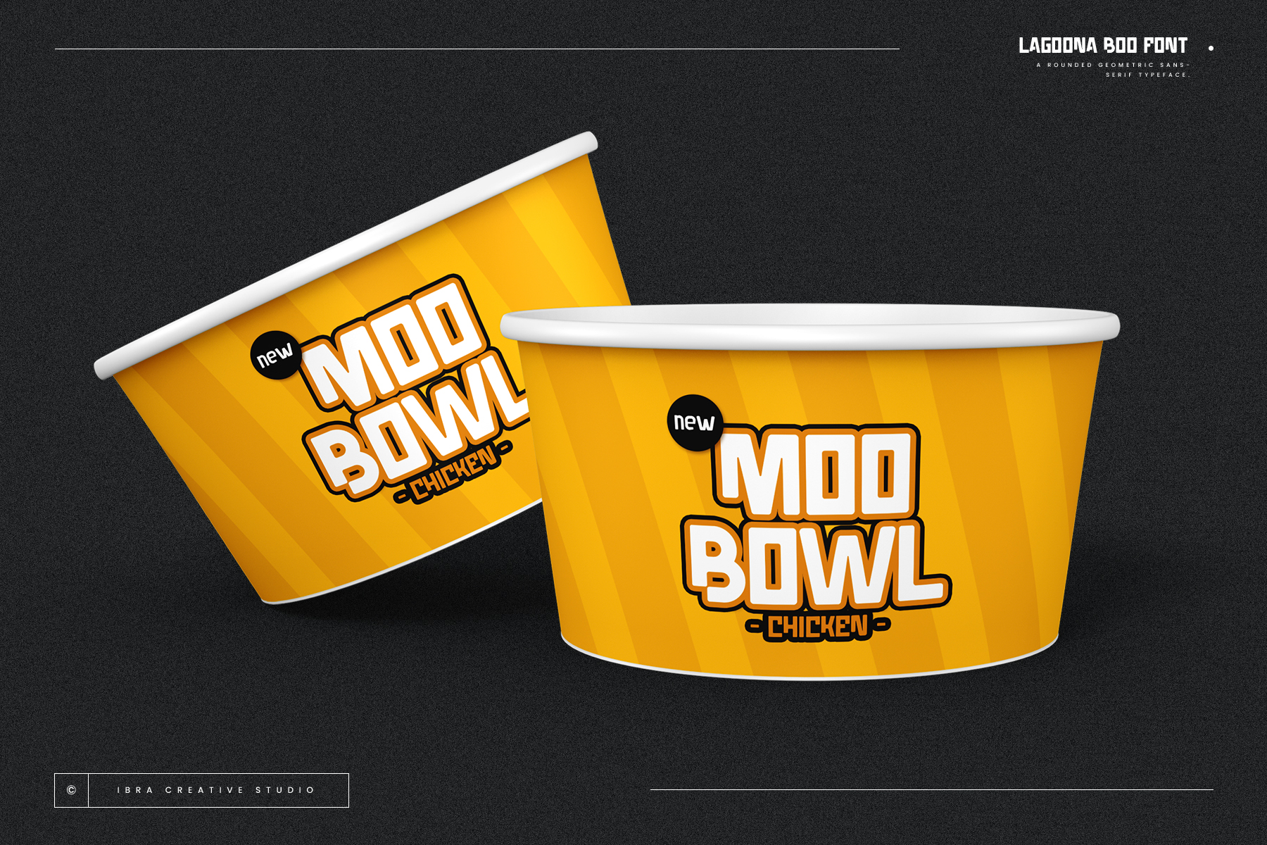
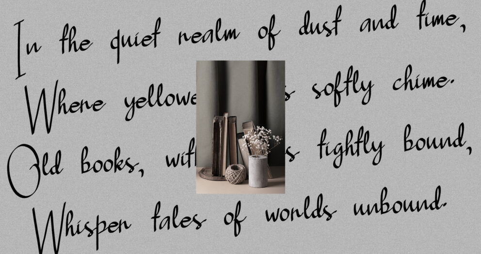
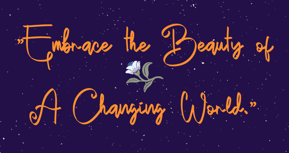
Each K-Pop group has its unique flavor, and the fonts they use are like the secret sauce that makes their image complete. EXO’s futuristic vibes, Twice’s playful scripts – every choice is a piece of the puzzle that makes up their identity.
Emotional Magic
These fonts do more than just look pretty; they make us feel things. A cute, bubbly font can make us happy and nostalgic, while a sleek, minimalist one can make us intrigued and excited about what’s to come.

Fonts = Feelings
It’s All About the Vibes
Think about it: when you see a font associated with your favorite band, it’s like meeting an old friend. It’s comforting, exciting, and feels like home. It’s not just a bunch of letters; it’s a feeling, an experience.
The Excitement Builder
Remember how hyped we get when we see a hint of a new font for an upcoming album? It’s like a sneak peek into a new era of music and style. It’s the typography version of a movie trailer!
Did You Know?
Here’s a fun fact for you: The font used in BTS’s ‘Love Yourself’ series was a hit, sparking a whole trend in fan art and merchandise. It’s like BTS’s magic touch extends to their fonts too!
Conclusion
So, next time you jam to a K-Pop tune or admire an album cover, take a moment to appreciate the fonts. They’re not just there to look pretty; they’re a big part of the K-Pop magic. It’s amazing how a few well-chosen letters can capture the spirit of the music and connect us all. In K-Pop, every detail counts, and the fonts are definitely singing their own tune!
Explore More Fonts
