Introduction
Creating an enticing font preview is like setting the stage for a star performer – it’s all about showcasing the font in its best light. Whether you’re a seasoned designer or a typography enthusiast, this guide will walk you through designing compelling font previews based on various themes and font types. Let’s dive in with some dummy font names and how their previews should be crafted.
Understanding Your Font’s Personality
Before designing a preview, understand your font’s character. Is it a serious, business-like Serif, a casual and friendly Script, or a modern, minimalistic Sans-serif? This understanding will guide your theme, color choice, and the text used in the preview.
Example Previews for Different Font Types
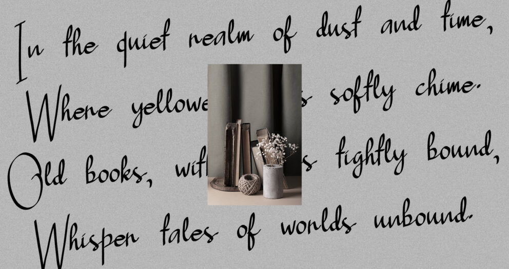
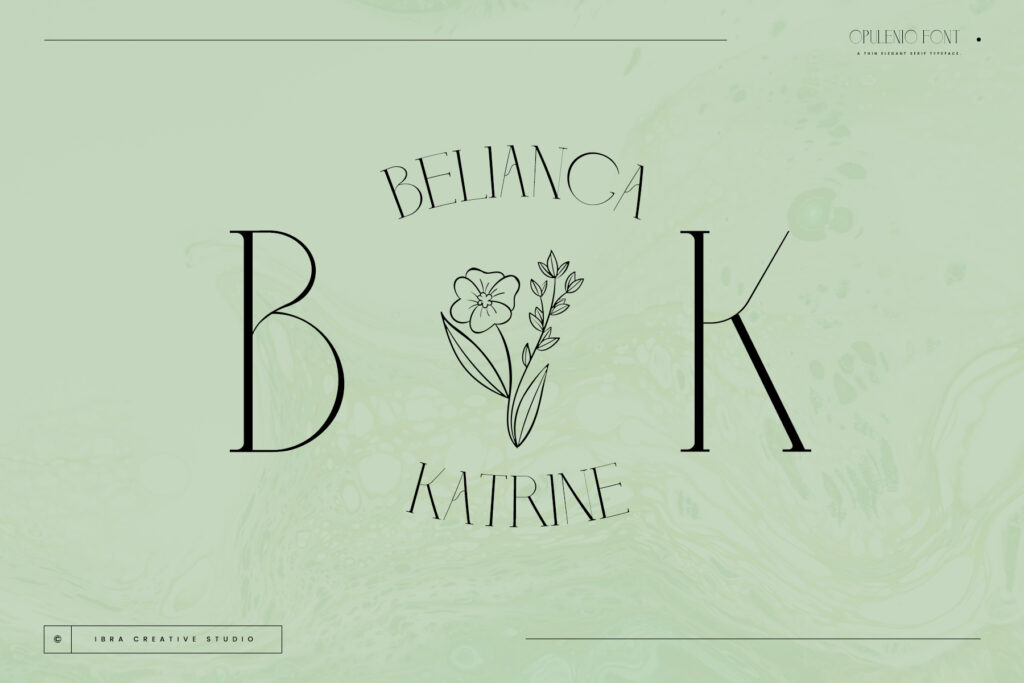
1. Font: “Elegante Serif”
Theme: Classic and Sophisticated
- Use a muted color palette with dark backgrounds and gold accents.
Sample Text: “Fine Dining at Château Élégance.”
- Include mock-ups of the font used in luxury product branding or upscale event invitations.
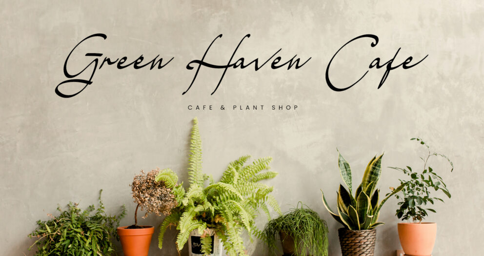
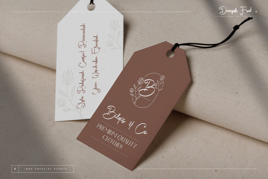
2. Font: “Breezy Script”
Theme: Light-hearted and Joyful
- Opt for bright, cheerful colors like sky blue or soft pink.
Sample Text: “Sunny Days and Pleasant Breezes.”
- Showcase the font in contexts like wedding invitations or boutique branding.

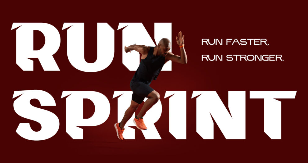
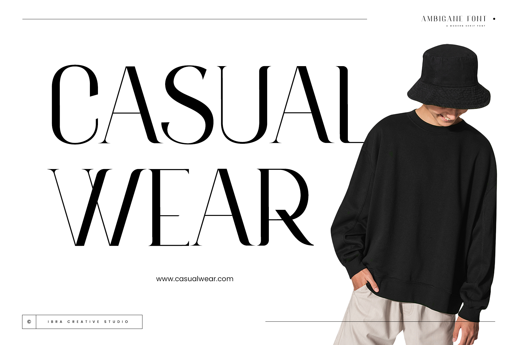
3. Font: “TechMono Sans”
Theme: Modern and High-Tech
- Use a monochrome palette with pops of neon to suggest a tech-savvy vibe.
Sample Text: “Innovating the Future, One Pixel at a Time.”
- Display the font in tech product ads, app interfaces, or digital marketing materials.

Adding Context to Your Preview
Use Mock-ups
Place your font in real-life mock-ups to give potential users an idea of how it looks in various applications. For “Elegante Serif,” you might show it on a wine label; for “Breezy Script,” on a boutique shop sign; and for “TechMono Sans,” on a smartphone screen.
Vary the Formatting
Show different weights, sizes, and styles. Display “Elegante Serif” in bold for headers and regular for body text; use “Breezy Script” in large sizes to highlight its fluidity; and present “TechMono Sans” in various weights to demonstrate versatility.
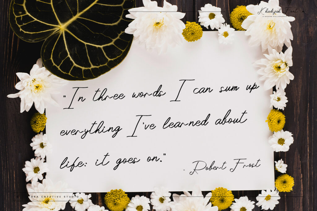
The Power of the Right Words
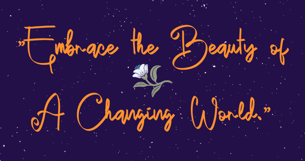
Choose sample texts that resonate with the font’s personality. For playful fonts, use whimsical or humorous phrases. For more serious fonts, opt for classic literature excerpts or profound quotes.
Adding Fun and Engagement
Interactive Elements
Consider adding interactive elements to your online font previews. Allow users to type in their text and see how it looks in your font – it’s engaging and practical.
Fun Fact or Quote
Did you know? “The quick brown fox jumps over the lazy dog” is a pangram used by typographers because it contains every letter of the English alphabet. Pretty neat, right?
Conclusion
Designing a font preview is an art in itself. It’s about creating a story around your font, one that captures its essence and shows off its potential. Remember, a well-crafted font preview not only showcases the font but also tells a story, engages the audience, and ultimately, makes the font irresistible. So, have fun with it, and let your font take center stage! Remember, in the world of typography, the right preview can make your font go from just being seen to being remembered.
Explore More Fonts