Typography plays a crucial role in web design, influencing the readability, aesthetics, and overall user experience of your website. In this article, we’ll delve into the art of mastering typography, offering valuable tips and tricks for selecting the perfect web font that will enhance your website’s appeal and effectiveness.
Understand Your Brand Identity:

Before diving into the vast sea of fonts, it’s essential to have a clear understanding of your brand identity and the message you want to convey. Consider the personality traits of your brand – is it modern and minimalist, playful and whimsical, or classic and elegant? Your choice of font should align with your brand’s values and resonate with your target audience.
Prioritize Readability:
While it’s tempting to opt for elaborate or decorative fonts, readability should always be your top priority when choosing a web font. Ensure that your selected font is legible across different screen sizes and devices, maintaining clarity and ease of reading for all users. Avoid overly stylized fonts that may sacrifice readability for aesthetics.
Consider the Hierarchy:

Typography plays a crucial role in establishing hierarchy and guiding users through your website’s content. Use different font weights, sizes, and styles to differentiate headings, subheadings, body text, and other elements. Consistent use of typography hierarchy enhances navigation and improves the overall user experience.
Test for Compatibility:

Before committing to a web font, it’s essential to test its compatibility across various web browsers and devices. Some fonts may render differently on different platforms, leading to inconsistencies in appearance. Use web font services or tools to preview how your chosen font will appear across different environments, ensuring a seamless experience for all users.
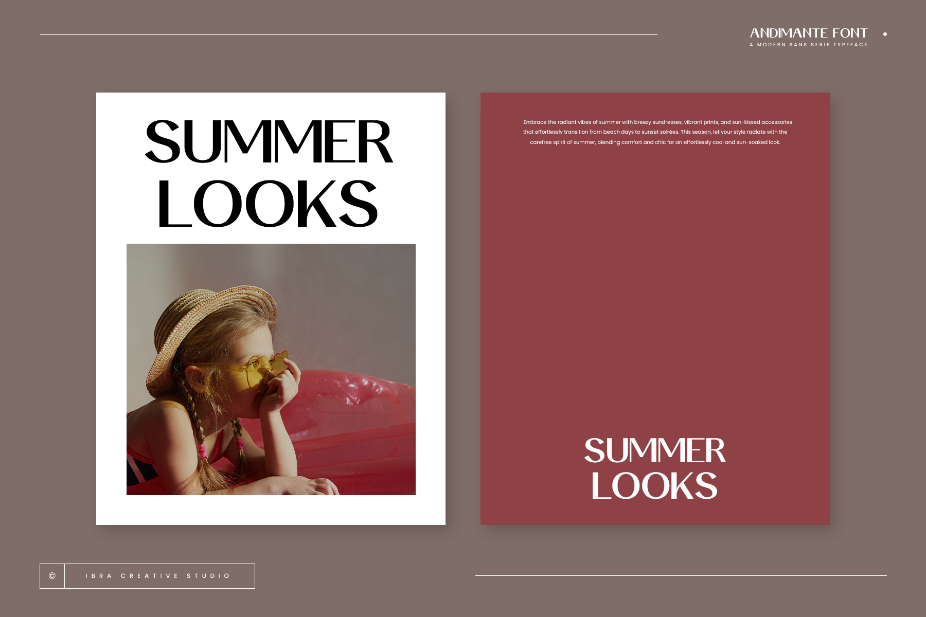
Embrace Contrast:

Contrast is a powerful tool in typography that adds visual interest and emphasis to your website’s content. Experiment with pairing contrasting fonts – such as pairing a serif font with a sans-serif font – to create dynamic and engaging text combinations. However, ensure that the contrast enhances readability and complements your brand’s aesthetic.
Optimize for Performance:

While aesthetics are important, it’s equally crucial to consider the performance implications of your chosen web font. Select fonts that are optimized for web use, prioritizing fast loading times and minimal impact on page speed. Consider using web font services that offer optimization features to ensure optimal performance without compromising on design quality.
Conclusion:
Mastering typography is a fundamental aspect of web design, influencing the overall look, feel, and functionality of your website. By following these tips and tricks for choosing the perfect web font, you can create visually stunning and user-friendly websites that leave a lasting impression on your audience.
Quote:
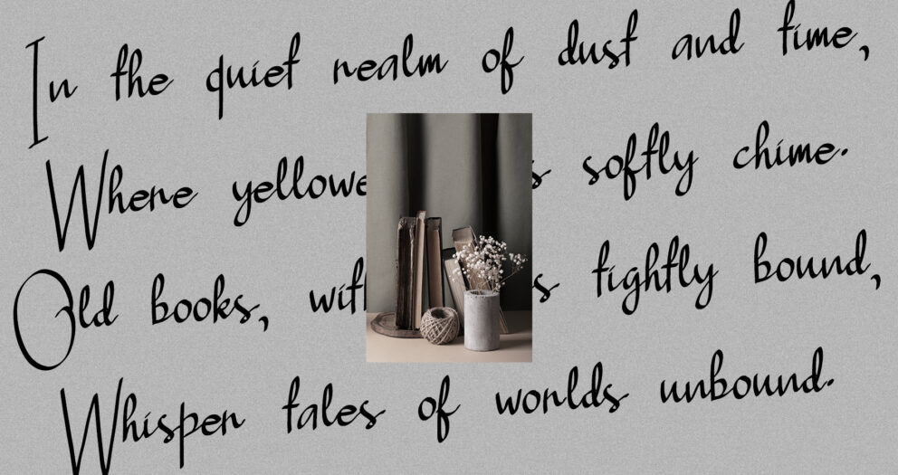
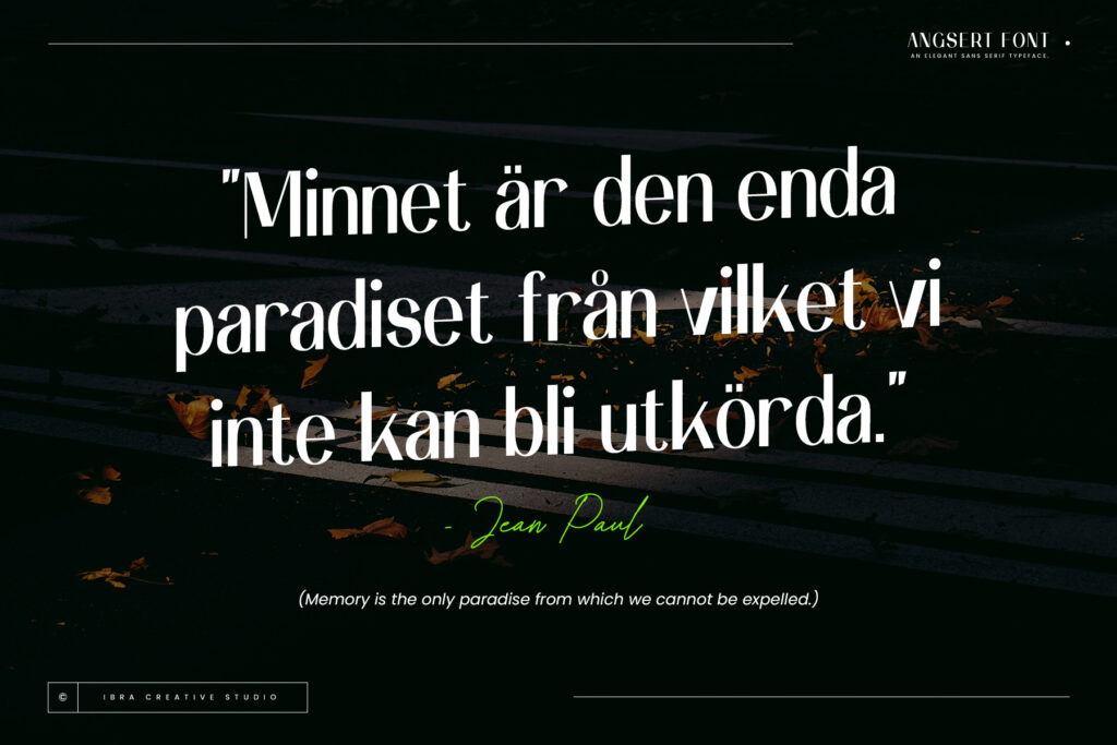
“Typography is the craft of endowing human language with a durable visual form.” – Robert Bringhurst
Explore More Fonts