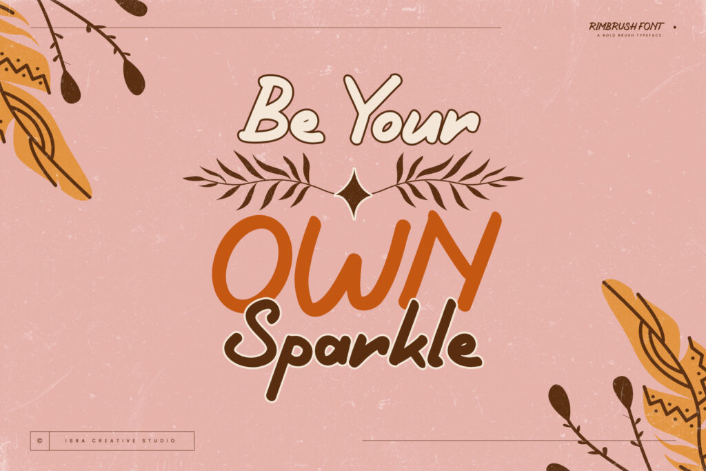
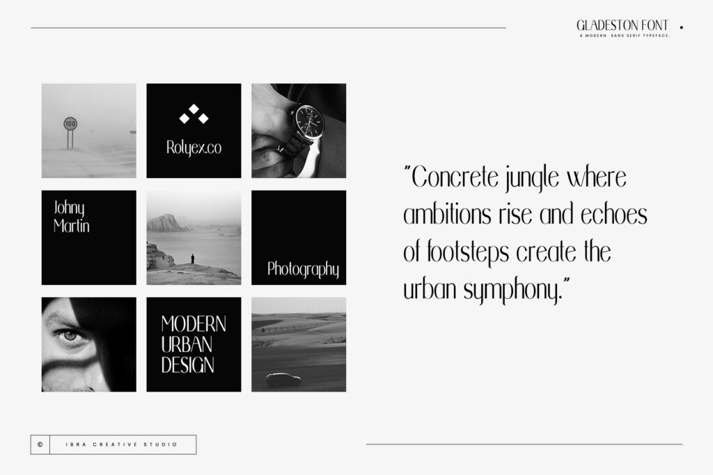
Fonts are like magic spells woven into the fabric of your website, casting a spell on visitors and guiding them through an enchanting digital experience. In this article, we’ll unlock the secrets of font selection, offering valuable tips and tricks to help you harness the transformative power of fonts and create captivating websites that leave a lasting impression.
Embrace Variety:
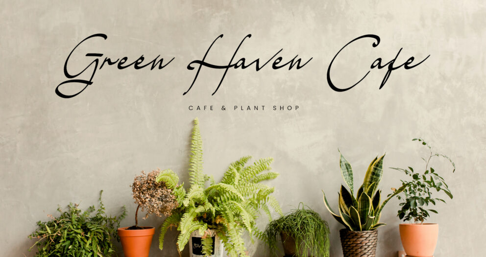
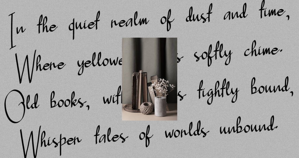
Just as a magician uses different spells to create awe and wonder, leverage the power of font variety to captivate your audience. Experiment with a mix of serif, sans-serif, script, and display fonts to add visual interest and personality to your website. However, maintain coherence by selecting fonts that complement each other and align with your brand’s identity.
Play with Typography Pairings:

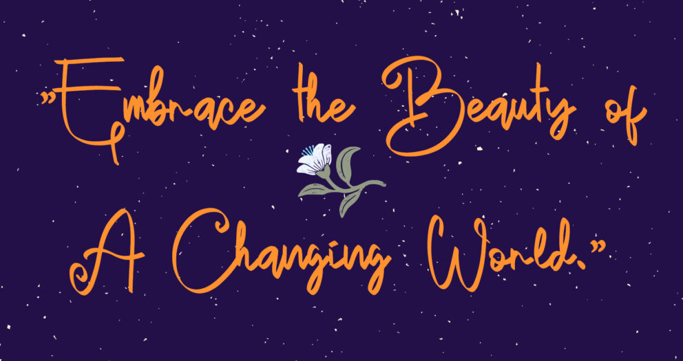
Like magic duos that complement each other’s strengths, explore typography pairings that create harmony and balance on your website. Pair a bold sans-serif headline font with a refined serif body font for a modern and sophisticated look. Alternatively, combine a playful script font with a clean sans-serif font for a whimsical and inviting feel.
Leverage Font Weight and Style:
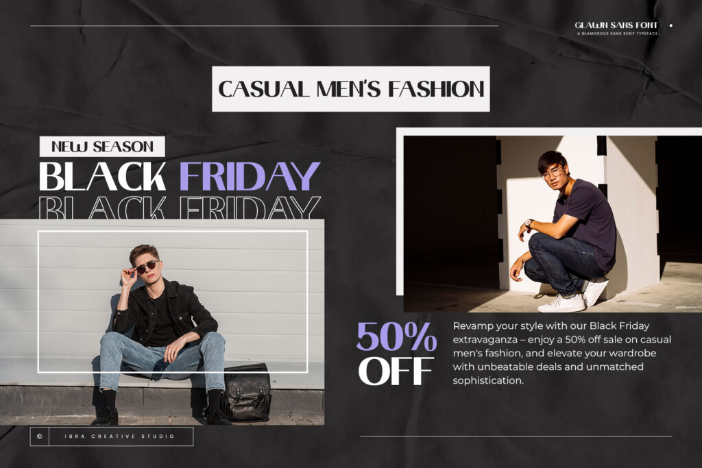
Just as a magician adjusts the intensity of their magic tricks, use font weight and style to convey hierarchy and emphasis in your website’s content. Experiment with different font weights – such as bold, regular, and light – to create visual contrast and draw attention to important elements. Additionally, utilize font styles like italics and underlines to add emphasis and emphasis to your text.
Mind the White Space:
Like the space between magical acts that builds anticipation, pay attention to the white space around your text to enhance readability and visual appeal. Ensure sufficient spacing between lines of text and paragraphs to prevent overcrowding and allow for comfortable reading. Additionally, use padding and margins to create breathing room around your text and highlight key content.
Align with Brand Identity:
Every magician has their signature style, and your website’s font choices should reflect your brand’s unique personality and identity. Choose fonts that resonate with your brand’s values and evoke the desired emotions in your audience. Whether you’re aiming for sophistication, playfulness, or elegance, select fonts that align with your brand’s identity and messaging.
Test and Iterate:

Magic spells are perfected through practice and experimentation, and the same holds true for font selection. Test different font combinations, styles, and layouts to see what resonates best with your audience and achieves your design goals. Don’t be afraid to iterate and refine your font choices based on feedback and performance metrics.
Conclusion:
Font selection is a powerful tool in the magician’s toolkit of website design, allowing you to weave a captivating narrative and cast a spell on your audience. By embracing font variety, experimenting with typography pairings, and aligning with your brand’s identity, you can unlock the magic of fonts and create websites that enchant and delight your visitors.
Quote:
“Typography is the art and technique of arranging type to make written language legible, readable, and appealing when displayed.” – Wikipedia
Explore More Fonts