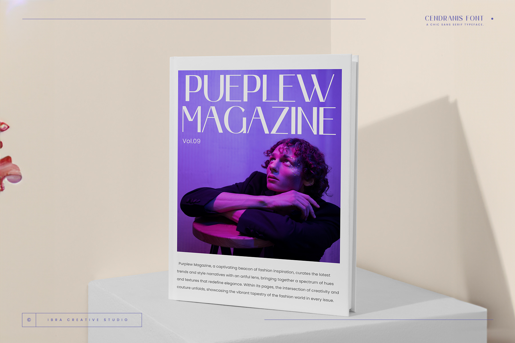
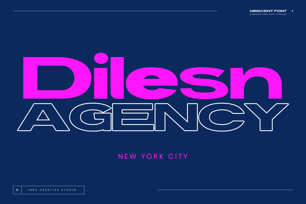
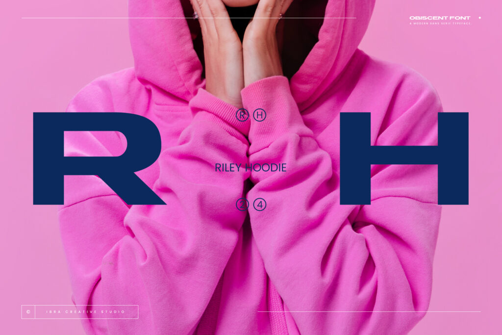
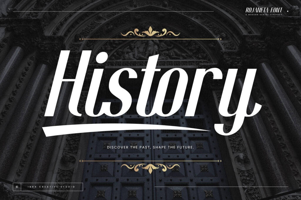
Font selection is a critical aspect of website design, influencing readability, aesthetics, and user experience. In this article, we’ll dive into the fundamentals of font selection, offering essential tips and guidelines to help you choose the perfect typeface for your website, ensuring it captivates your audience and effectively communicates your message.
Determine Your Website’s Purpose:

Before selecting a typeface, it’s essential to clarify the purpose and goals of your website. Are you creating a professional portfolio, an e-commerce platform, or a blog? The intended audience and content of your website will influence the appropriate typeface style and tone. For example, a formal business website may require a classic serif font, while a creative portfolio might benefit from a modern sans-serif font.
Consider Readability and Legibility:
The primary function of text on a website is to convey information effectively. Therefore, prioritize readability and legibility when choosing a typeface. Select fonts with clear letterforms, sufficient spacing, and appropriate x-heights to ensure easy reading across different screen sizes and devices. Avoid overly decorative or stylized fonts that may sacrifice readability for aesthetics.
Reflect Your Brand Identity:
Your website’s typeface should reflect your brand’s identity and personality. Consider the values, tone, and aesthetic of your brand when selecting a typeface. Choose fonts that evoke the desired emotions and resonate with your target audience. Whether you’re aiming for sophistication, playfulness, or minimalism, your typeface should align with your brand’s identity and messaging.
Explore Font Families and Variants:

Many typefaces come in a variety of font families and variants, offering versatility and flexibility in design. Explore different font weights, styles, and variants within a typeface family to create visual hierarchy and emphasis in your website’s content. Utilize bold, italic, and light variants to differentiate headings, subheadings, and body text, enhancing readability and visual appeal.
Test Across Devices and Screen Sizes:
Once you’ve narrowed down your font choices, it’s crucial to test them across various devices and screen sizes to ensure consistency and readability. Use responsive design principles to adapt your chosen typeface for different screen resolutions and orientations. Consider how your typeface renders on desktops, laptops, tablets, and smartphones, making adjustments as needed for optimal readability and user experience.
Seek Feedback and Iterate:

Font selection is a subjective process, and it’s helpful to seek feedback from colleagues, clients, or focus groups to gather diverse perspectives. Present different font options and variations to gauge reactions and preferences. Be open to constructive criticism and iterate on your font choices based on feedback, striving for a consensus that aligns with your design goals and objectives.
Conclusion:
Choosing the right typeface for your website is a critical decision that can significantly impact its success. By considering factors such as readability, brand identity, and versatility, you can select a typeface that enhances your website’s aesthetics and effectively communicates your message to your audience.
Quote:
“Typography is the craft of endowing human language with a durable visual form.” – Robert Bringhurst
Explore More Fonts