Font fusion is the art of harmoniously combining different typefaces to create visually stunning and cohesive designs. In this article, we’ll explore the principles of font pairing and offer expert tips for mixing and matching fonts like a pro on your website. With the right approach, you can create dynamic and engaging typographic compositions that elevate your website’s design to new heights.
Understand Typeface Categories:
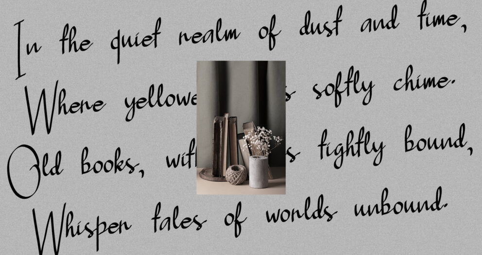
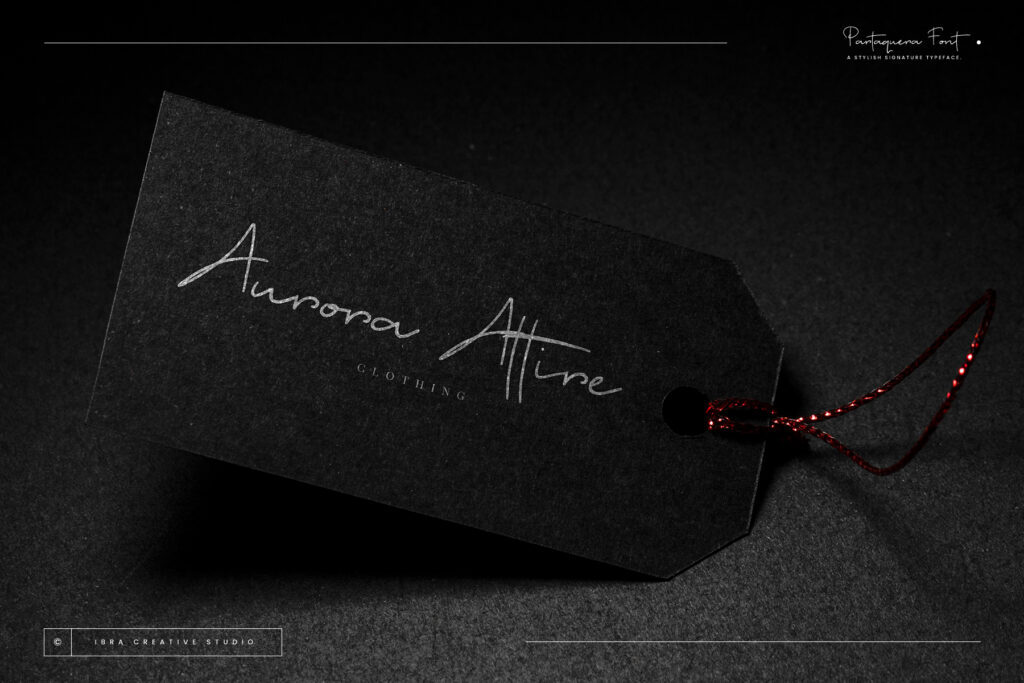
Before diving into font pairing, it’s essential to understand the different categories of typefaces and their characteristics. Serif fonts convey a sense of tradition and elegance, while sans-serif fonts are modern and minimalistic. Script fonts add a touch of elegance and whimsy, while display fonts are decorative and attention-grabbing. By understanding these categories, you can choose complementary typefaces that work well together.
Aim for Contrast:
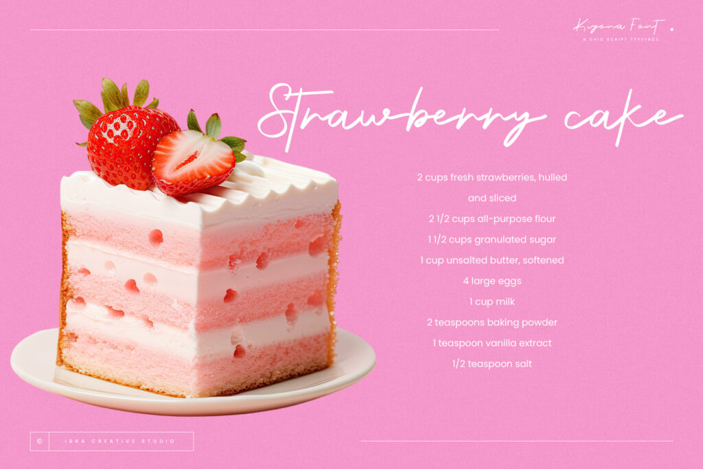
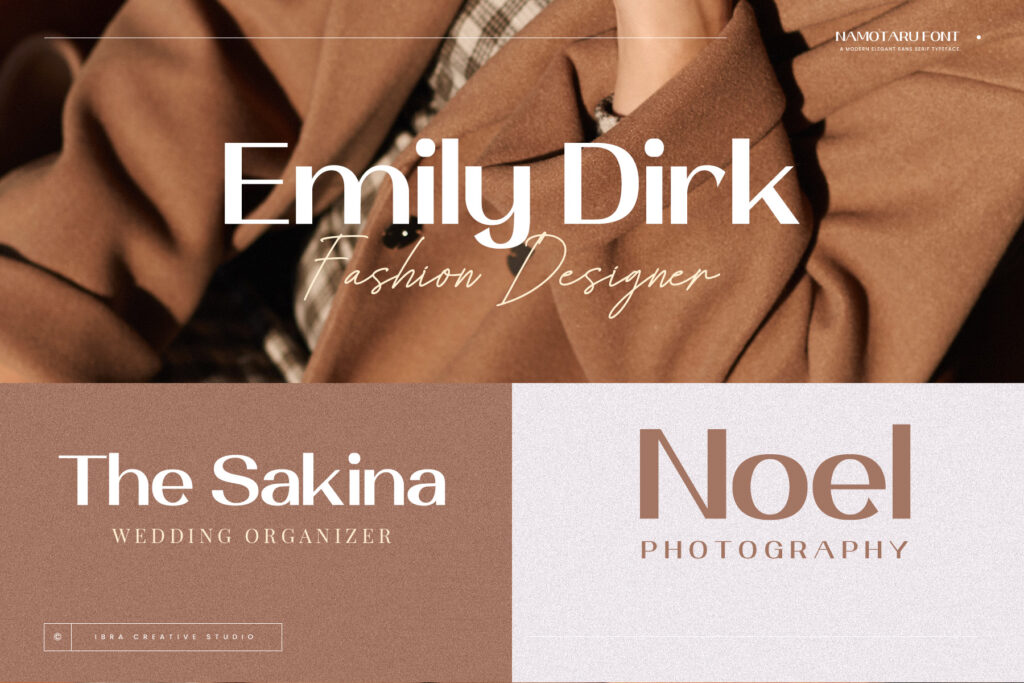
One of the key principles of font fusion is contrast. Contrasting typefaces create visual interest and hierarchy, making it easier for users to navigate your website’s content. Pairing a bold, uppercase display font with a delicate, lowercase script font, for example, creates a striking contrast that draws the eye and highlights important information. Experiment with different combinations to find the right balance of contrast for your design.
Focus on Harmony:

While contrast is important, it’s also crucial to maintain harmony and cohesion in your font pairings. Choose typefaces that share similar proportions, x-heights, and visual characteristics to create a unified look and feel. Consider the overall mood and tone of your website, as well as your brand’s identity, when selecting fonts. A harmonious combination of typefaces will enhance the readability and aesthetics of your design.
Limit Your Selection:

When it comes to font pairing, less is often more. Limit yourself to two or three typefaces to avoid overwhelming your design with too many competing elements. Choose a primary font for headlines and a secondary font for body text, with a third font reserved for accents or special occasions. Keeping your font selection streamlined will create a more cohesive and visually appealing design.
Test and Iterate:
Font pairing is a creative process that requires experimentation and iteration. Test different combinations of typefaces to see how they work together in different contexts. Pay attention to factors such as readability, legibility, and visual hierarchy. Solicit feedback from colleagues, clients, or focus groups to gather diverse perspectives and refine your font pairings based on their input.
Embrace Personality:
Fonts have personalities of their own, and font pairing is an opportunity to express your website’s unique character and style. Whether you’re aiming for a sleek and professional look or a playful and whimsical feel, choose typefaces that reflect your brand’s personality and resonate with your target audience. Embrace the opportunity to infuse your design with personality and charm through thoughtful font selection.
Conclusion:
Font fusion is a powerful design technique that can elevate your website’s typography from ordinary to extraordinary. By understanding typeface categories, aiming for contrast and harmony, limiting your selection, testing and iterating, and embracing personality, you can master the art of mixing and matching fonts like a pro. With the right approach, you can create visually stunning and cohesive designs that captivate your audience and leave a lasting impression.
Quote:
“Typography is the art of creating visual language.” – Paula Scher
Explore More Fonts<br