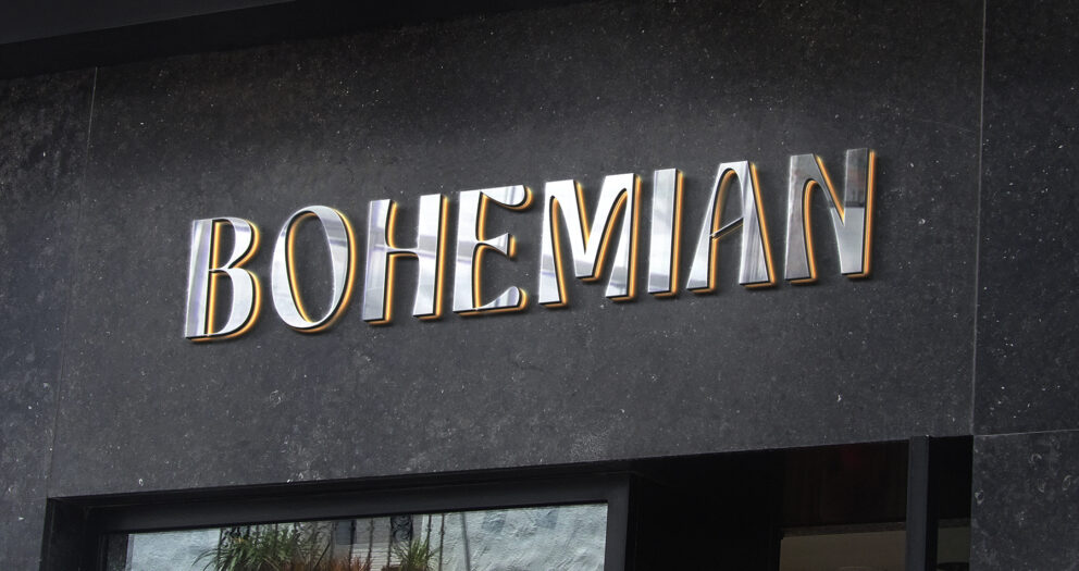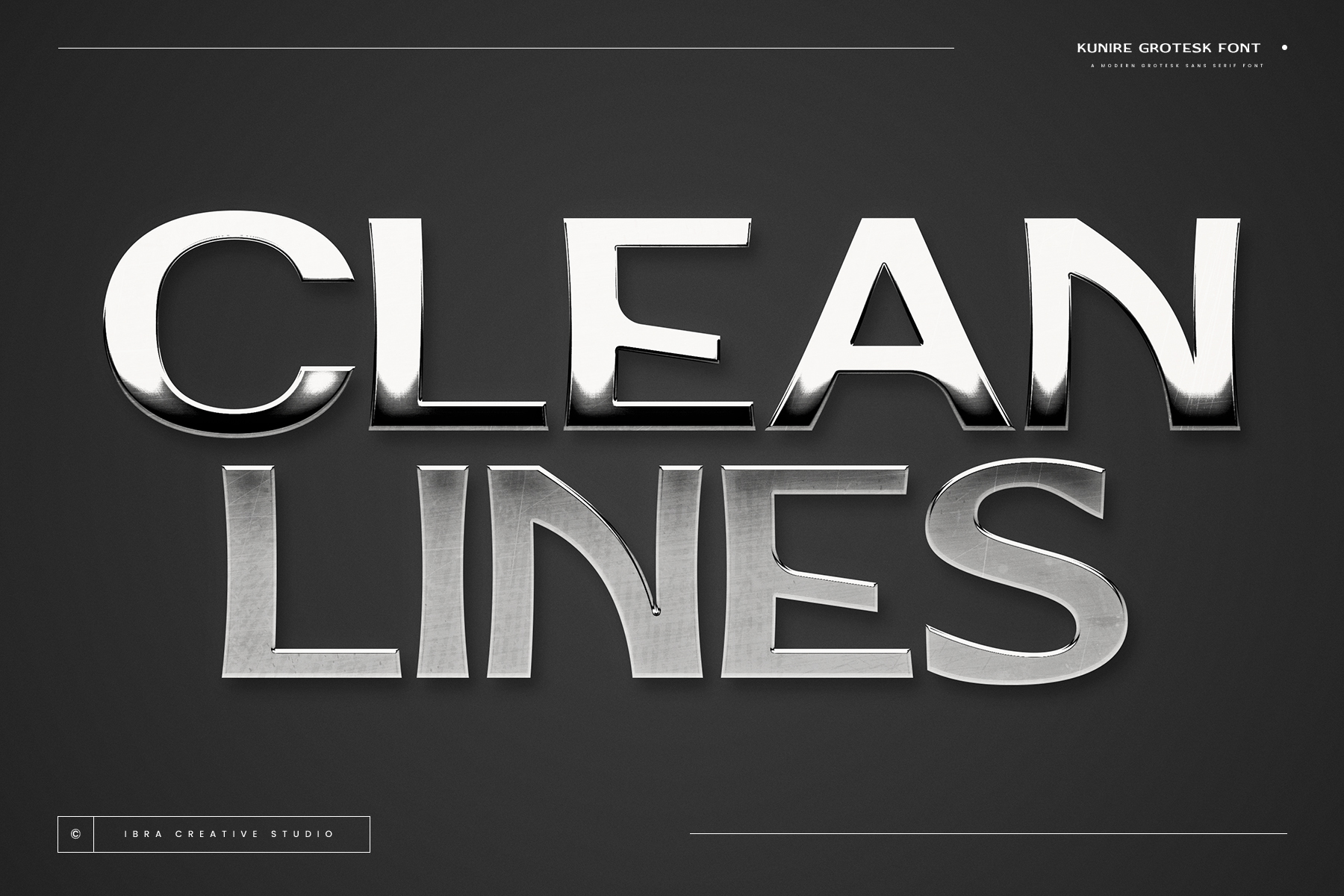
In today’s interconnected world, the need for effective, cross-cultural communication is more important than ever. Whether you’re designing for a global brand, creating digital content, or working on editorial layouts, choosing the right font can make or break the message you want to convey. Kunire Grotesk, a modern grotesque sans-serif font, stands out as an exceptional solution for multilingual design projects. Its seamless integration into diverse global markets and its ability to maintain clarity across languages make it an ideal choice for designers working in an international context.
Kunire Grotesk: A Modern Twist on a Classic Typeface
Kunire Grotesk brings a contemporary edge to the timeless principles of grotesque design. With its clean lines, geometric shapes, and distinct angular terminals, this font exudes a polished and professional appearance, while still embracing the design language of the past. The balance between simplicity and intricacy in Kunire Grotesk creates a unique visual aesthetic that’s both refined and modern, making it suitable for a wide variety of design applications, from editorial layouts to branding and digital platforms.
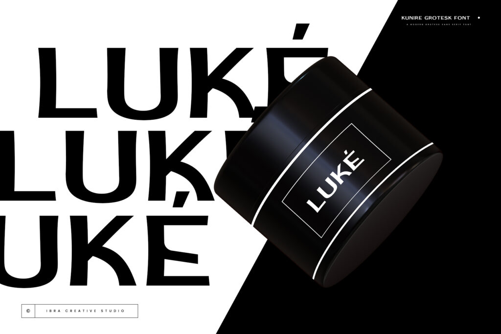
What sets Kunire Grotesk apart is its versatility and ability to seamlessly integrate into projects that target global audiences. The font offers a range of weights and styles, ensuring that it adapts to both large-scale branding campaigns and smaller, localized digital content. Its straightforward yet sophisticated look makes it a go-to typeface for projects where clarity, professionalism, and universal appeal are paramount.
Bridging Cultural and Linguistic Gaps
One of the biggest challenges in global design is ensuring that your typography communicates clearly across various languages and cultures. Fonts with limited language support can create confusion and disrupt the overall flow of a design, especially when dealing with languages that use unique characters or complex diacritics. Kunire Grotesk, however, was built with multilingual support in mind, making it an excellent choice for designers working on international projects.

Kunire Grotesk offers robust international language support, including the ability to render characters and symbols across a wide range of scripts. Whether you’re working with Latin, Cyrillic, Greek, or languages that use accented characters, this font ensures your designs maintain a consistent, professional look in any linguistic context. The careful design of the letterforms, from the geometric shapes to the crisp terminals, ensures that the font remains legible and visually appealing, no matter the language.
Perfect for Diverse Design Applications
From branding to editorial design, Kunire Grotesk provides the flexibility to adapt to any project. Its neutral yet sophisticated design allows it to blend seamlessly with both traditional and modern design styles, making it a versatile option for projects that need to cater to a wide audience.
- Branding and Logos: Whether you’re creating a logo for a global company or rebranding an international business, Kunire Grotesk’s clean lines and professional appearance ensure your message is bold and impactful across various markets.
- Editorial Layouts: Kunire Grotesk’s well-defined strokes and legible letterforms make it ideal for editorial projects such as magazines, newspapers, and online publications, where clarity and readability are crucial.
- Digital and Print Applications: The font’s versatility extends to both print materials and digital interfaces, allowing designers to maintain a cohesive visual identity across different mediums, from websites to brochures to mobile apps.
Seamless Integration for Global Design
For designers working on international projects, Kunire Grotesk simplifies the process of creating consistent, high quality designs that resonate across cultural and linguistic boundaries. By offering clear communication through universal legibility, the font ensures that your message reaches a wider, more diverse audience without compromising style or impact.
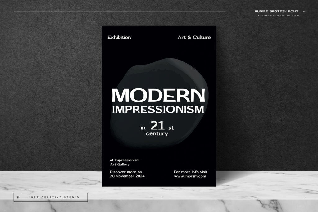
In today’s world, where global communication is paramount, having a font that works across languages while maintaining its professional, modern appearance is essential. Kunire Grotesk delivers exactly that combining sophistication with international adaptability to meet the demands of global design projects.
Test drive now!Conclusion: A Typeface that Speaks to the World
When it comes to effective design, especially in a multilingual context, the right font can elevate your work and ensure your message is delivered clearly and professionally. Kunire Grotesk is the ideal font for designers who need a typeface that blends timeless elegance with modern appeal, all while supporting multiple languages and scripts. It’s a font that speaks to the world, uniting cultures and languages with its crisp, legible design.
Explore More Fonts