In an increasingly connected world, design projects must seamlessly adapt to different cultures, languages, and contexts. Whether you’re working on a global branding campaign, a multilingual website, or an editorial layout, choosing a typeface that supports international languages while maintaining a polished aesthetic is key. Enter Kalpatrie a modern skinny sans-serif font that epitomizes sleek design and robust versatility for multilingual projects.
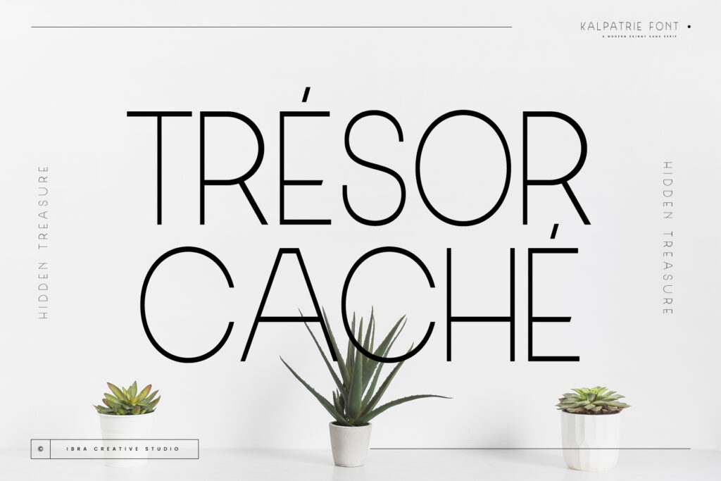
Kalpatrie: A Typeface for the Global Stage
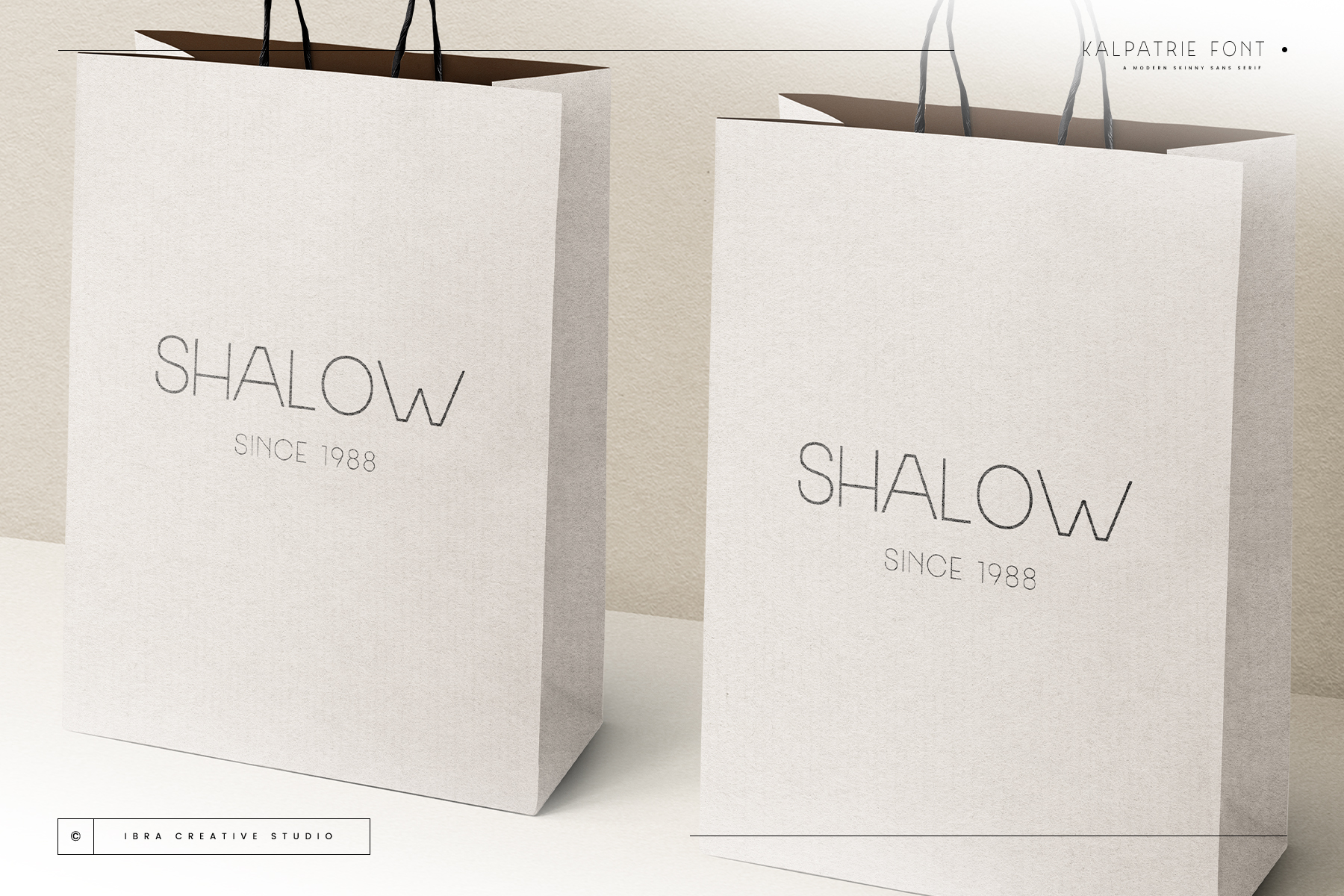
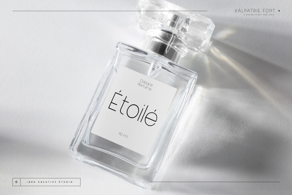
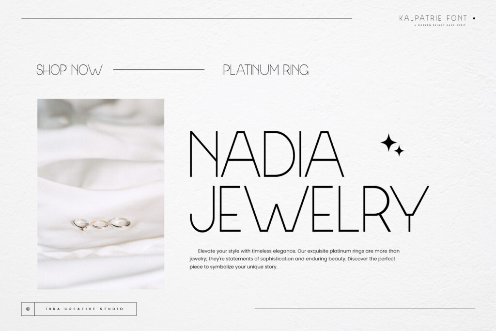
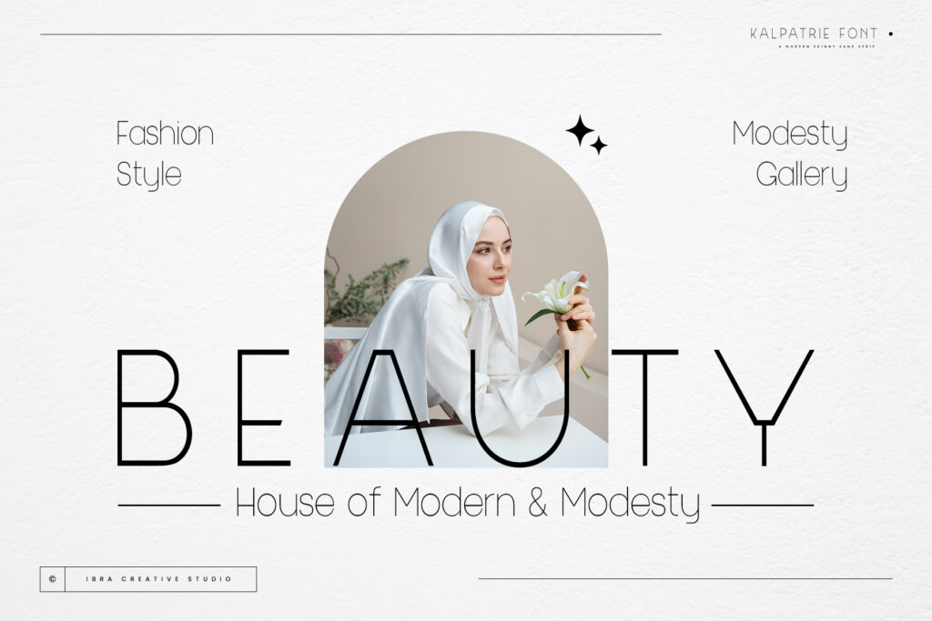
At its core, Kalpatrie is a slender sans-serif font designed with modern aesthetics and global adaptability in mind. With clean lines and a minimalist style, it exudes a sense of sophistication that enhances the professionalism of any project. The font’s slender letterforms give it a contemporary elegance, making it ideal for branding, editorial design, and digital interfaces. But Kalpatrie’s value goes beyond looks its extensive character set makes it a powerful tool for cross-cultural communication.
Why Kalpatrie Is Perfect for Multilingual Design
- Universal Design Appeal: Kalpatrie’s sleek and slim design is universally appealing. Its minimalist structure ensures that the font works well across different cultures, offering a refined look that transcends regional design preferences. Whether you’re designing for European markets or extending your reach to East Asia, Kalpatrie’s neutral yet sophisticated style adapts effortlessly.
- Multilingual Support: One of Kalpatrie’s key features is its comprehensive support for multiple languages. This makes it a highly versatile font for businesses and designers working on projects that span various regions and languages. From Latin-based languages to more complex scripts, Kalpatrie’s thoughtful letterforms ensure clarity and consistency across the board, allowing your message to resonate with a global audience.
- Enhanced Readability and Precision: Despite its slim and refined appearance, Kalpatrie maintains high readability. The uniform stroke widths and carefully crafted letterforms make it easy to read across different mediums, whether it’s print, web, or mobile. This clarity, combined with its sleek appearance, ensures that the font performs well in both formal and contemporary design settings.
- Ideal for Global Branding and Digital Interfaces: Kalpatrie’s modern, polished look makes it an excellent choice for global branding initiatives. Whether your brand is targeting consumers in Asia, Europe, or the Americas, the font’s refined yet approachable feel ensures your designs convey professionalism and innovation. Additionally, Kalpatrie’s clean lines and balanced proportions make it ideal for user interfaces and digital platforms, ensuring that content is easily digestible across languages and cultures.
- Versatile for Both Print and Digital Media: Whether you’re designing sleek editorial layouts or working on a digital product that needs to communicate in multiple languages, Kalpatrie is versatile enough to handle both. Its adaptability ensures that your message retains its impact, regardless of the medium or language.
Kalpatrie in Action: Bridging Cultural and Linguistic Gaps
In the fast paced world of design, the ability to create visuals that communicate across borders is essential. Kalpatrie steps in as a global design solution, offering a font that can unify your brand across various cultures and languages. Imagine launching a multilingual website for a tech startup. The slim, contemporary style of Kalpatrie not only enhances your digital presence but also ensures that text in multiple languages remains consistent and clear, giving users a seamless experience no matter where they are.
For international brands, having a font like Kalpatrie that balances elegance with functionality means that your brand identity will be coherent and professional across different markets. Whether you’re designing advertisements in multiple languages or creating product packaging that needs to speak to global consumers, Kalpatrie ensures that your typography remains both polished and adaptable.
Global Design, Refined Communication
In today’s interconnected world, typography is more than just a design element it’s a tool for bridging cultural gaps and ensuring clarity in communication. Kalpatrie, with its modern aesthetic and multilingual capabilities, is designed to help designers and brands break down linguistic barriers while maintaining a sleek, contemporary look.
As you consider typefaces for your next global project, think of Kalpatrie as the go-to font that brings together elegance, precision, and versatility in one cohesive design tool. Whether you’re working on a high end fashion brand, a technology startup, or a global marketing campaign, Kalpatrie provides the sophistication and readability needed for a truly universal design.
Conclusion: A Modern Typeface for a Global Audience
Typography is more than just a visual element it’s a way to communicate ideas across languages and cultures. Kalpatrie, with its modern elegance and robust multilingual support, is the perfect solution for designers looking to create projects that speak to a global audience with clarity and style.
Test drive now!Explore More Fonts