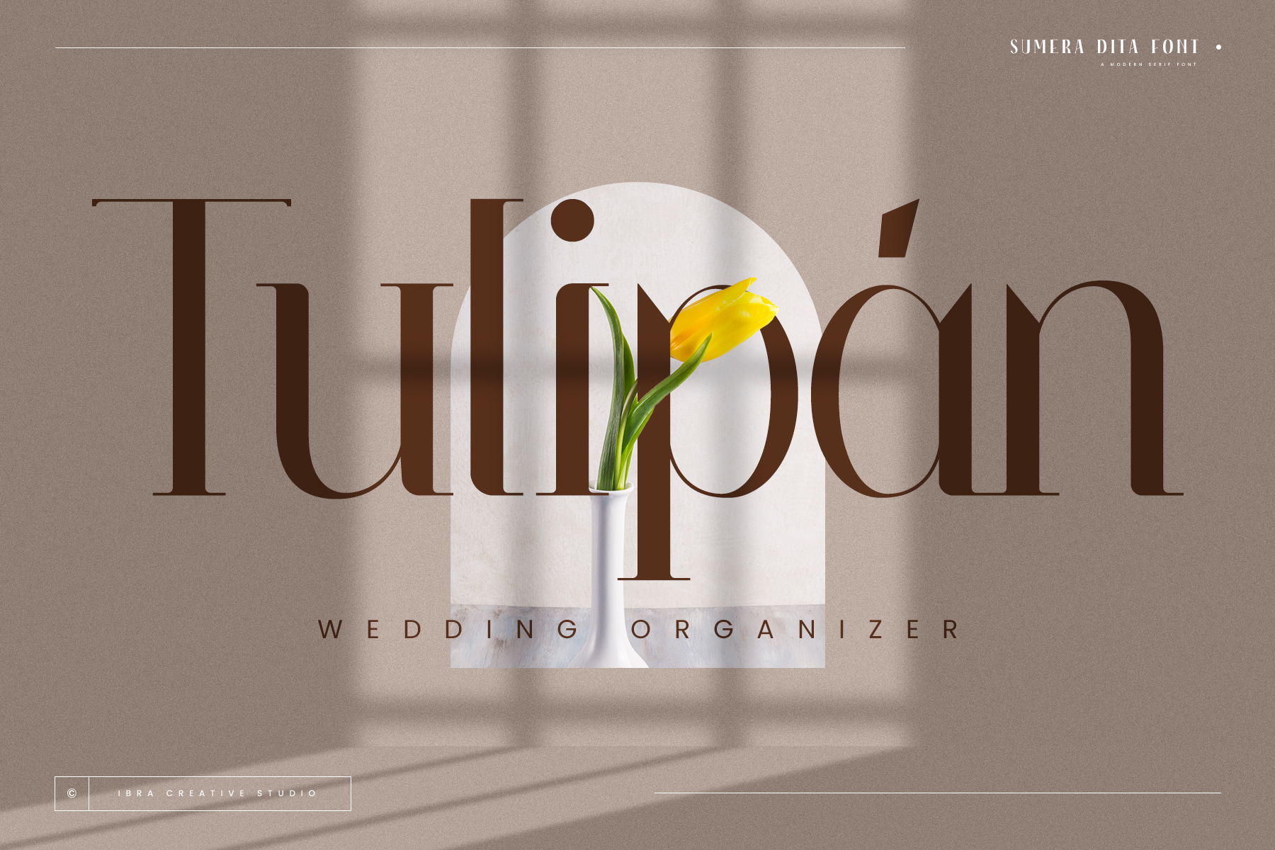
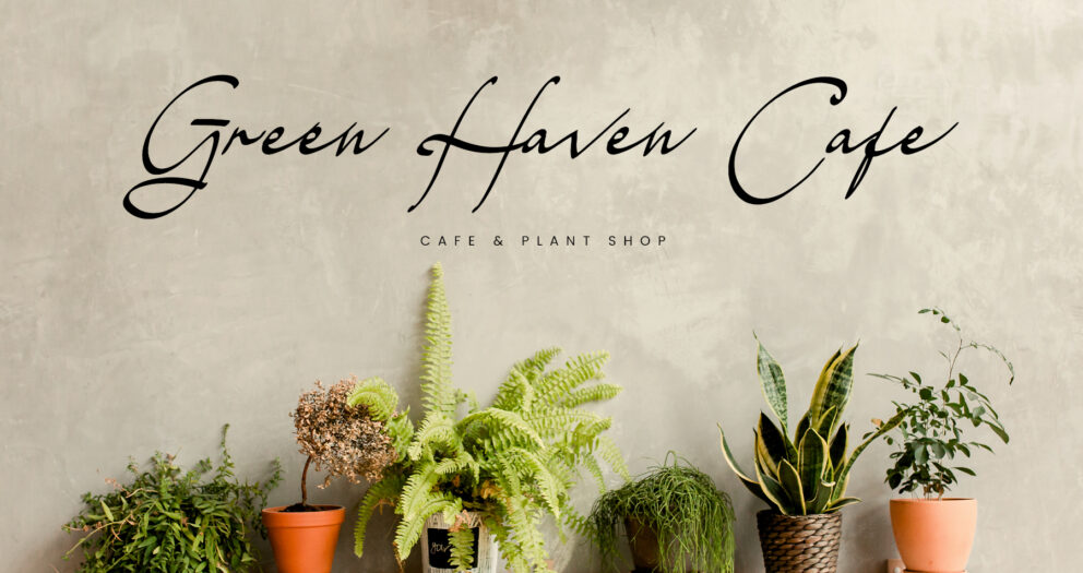
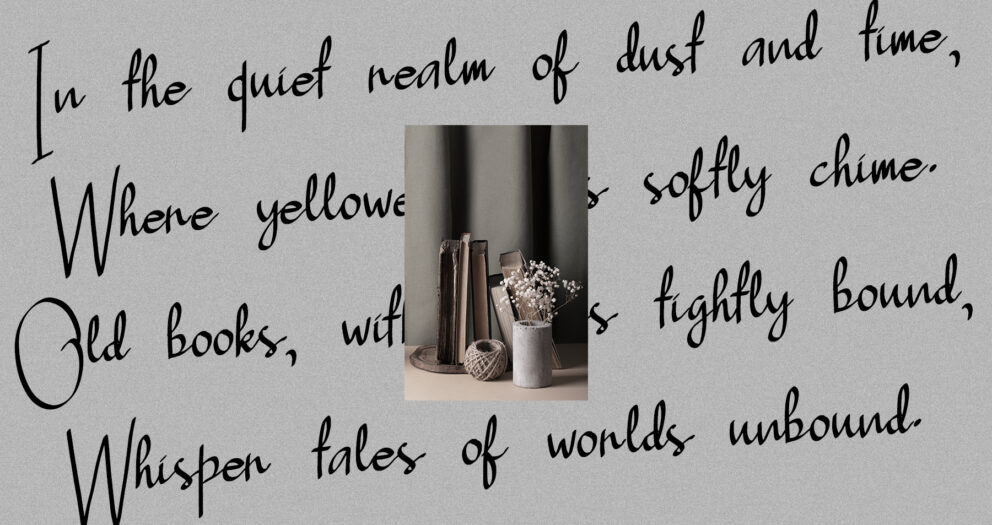
In today’s global design landscape, choosing the right typeface can make or break a project’s ability to communicate effectively across different languages and cultures. Sumera Dita, a modern serif font, is designed to do just that bringing elegance, sophistication, and global accessibility to any design. With its finely balanced letterforms and extensive multilingual support, Sumera Dita is the perfect solution for designers looking to bridge cultural and linguistic gaps, while maintaining a polished, professional look.
Sumera Dita: The Perfect Blend of Tradition and Innovation
Sumera Dita is a typeface that beautifully marries classic serif features with modern sensibilities. Its elegantly sculpted serifs and distinctive letter shapes create a sense of timeless grace, while still feeling fresh and contemporary. This balance makes Sumera Dita versatile enough to be used across a variety of design applications, from editorial layouts and branding to digital platforms and luxury packaging.
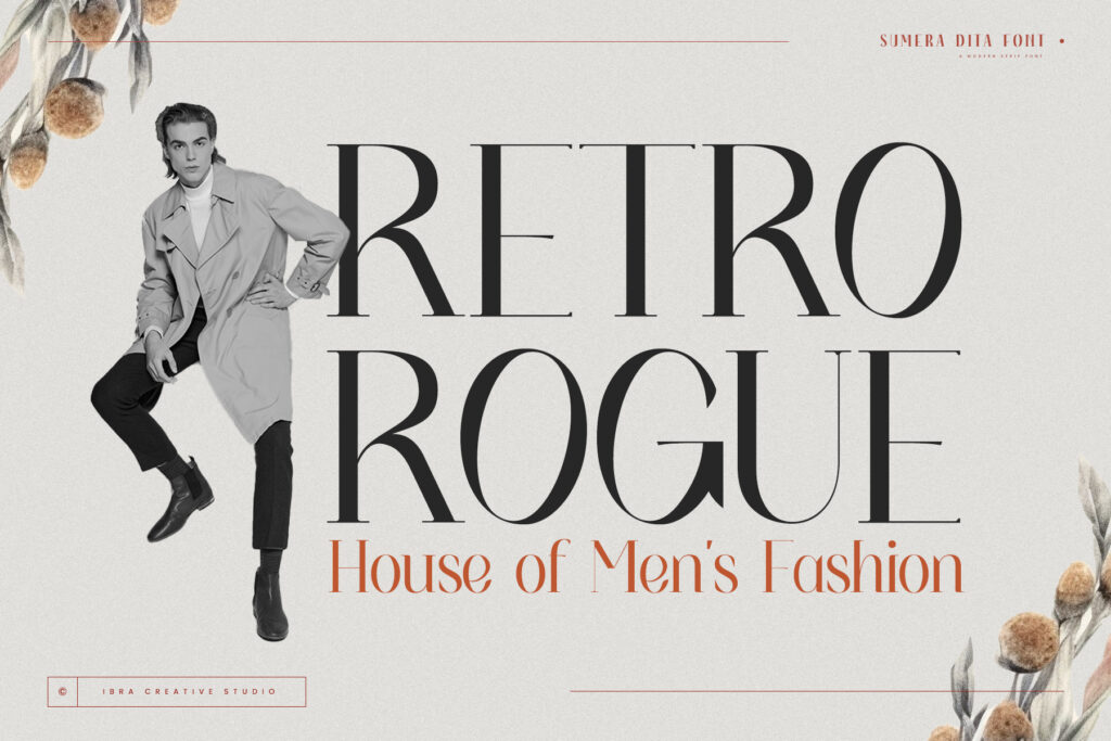
One of the standout features of Sumera Dita is its multilingual flexibility. In an increasingly connected world, where businesses and brands operate on a global scale, the ability to communicate seamlessly in multiple languages is crucial. Sumera Dita’s robust support for international characters ensures that your message remains clear, cohesive, and visually stunning, no matter what language you’re using.
Why Multilingual Support is Critical for Global Design
The need for multilingual typefaces has never been more important. Brands are expanding into new markets, and designers are tasked with creating visuals that speak to audiences across borders. Typography that supports multiple languages without sacrificing readability or aesthetic appeal is essential for maintaining consistency and ensuring effective communication.
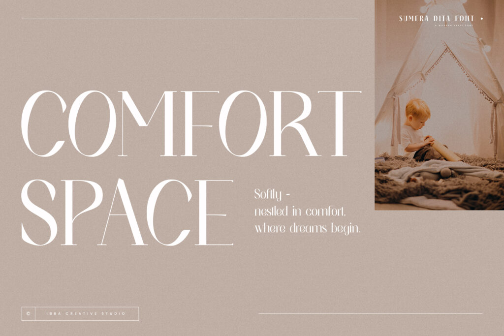
Sumera Dita offers extensive support for a wide range of languages, including those with accented characters and special glyphs. This means that whether you’re designing for English-speaking audiences, European markets, or other global regions, Sumera Dita can handle the linguistic challenges, allowing you to maintain the same design aesthetic across all languages.
Where to Use Sumera Dita in Your Design Projects
The elegance and versatility of Sumera Dita make it suitable for a wide range of creative projects. Here are a few key areas where this font can elevate your work:
- Editorial and Print Design: Sumera Dita’s clean, refined letterforms make it an ideal choice for magazines, books, and long-form content. Its classic serif design ensures readability while adding a touch of modern sophistication to any layout.
- Branding and Identity: If you’re looking for a font that conveys professionalism and elegance, Sumera Dita is perfect for brand logos, business cards, and corporate stationery. Its harmonious balance between tradition and innovation makes it suitable for both established brands and new ventures.
- Digital Media and Websites: Sumera Dita’s adaptability ensures that it looks just as good on a screen as it does in print. Whether you’re designing a sleek website or creating content for social media, this font’s readability and modern flair make it a strong choice for digital platforms.
- Luxury Packaging: For high-end products, packaging needs to convey a sense of quality and exclusivity. Sumera Dita’s elegant serifs and distinctive letter shapes give product packaging a polished, luxurious feel that leaves a lasting impression.
The Role of Sumera Dita in Multilingual Design Projects
Designing for a global audience requires a typeface that can handle the complexities of multiple languages while maintaining a consistent look and feel. Sumera Dita’s multilingual capabilities allow designers to achieve this effortlessly. The font’s carefully crafted serifs and balanced letterforms ensure readability across different languages, so your designs can communicate clearly, no matter the market.

Sumera Dita’s timeless aesthetic also lends itself to creating visuals that feel both familiar and contemporary. This makes it the ideal choice for brands and businesses looking to expand internationally, while maintaining a cohesive visual identity across different regions.
Test drive now!Conclusion: Sumera Dita – The Typeface for Global Elegance
Typography is more than just letters—it’s an essential part of how brands communicate their message. With Sumera Dita, designers get a typeface that not only looks stunning but also performs across multiple languages and cultures. Its blend of traditional serif design with modern elements ensures that your projects will stand out while remaining accessible to a global audience.
Explore More Fonts
