Introduction
In the high-energy world of K-Pop, where music meets visual art, fonts play a lead role in the fan experience. Groups like Blackpink have mastered the art of using a variety of fonts in their album covers, song titles, and logos, creating a visual language that speaks directly to the hearts of their fans. Let’s decode how these typographic choices influence the psychology of fans, with a sprinkle of fun and a dash of insight.
The Blackpink Phenomenon: A Typographic Journey
The Bold and the Beautiful
Blackpink’s use of bold, edgy fonts in their logo and album titles isn’t just about aesthetics; it’s a statement. The sharp angles and sleek design embody the group’s modern and powerful image. It’s as if the fonts are saying, “We’re here, we’re fierce, and we’re not backing down” – much like the attitude of their music.
K-Pop Typography: More Than Just Letters
A Visual Symphony
K-Pop albums are like a buffet of fonts – each one carefully chosen to complement the theme and tone of the music. From the futuristic fonts of EXO to the whimsical scripts of Twice, each group uses typography to set the stage for their musical stories.
Creating an Emotional Connection
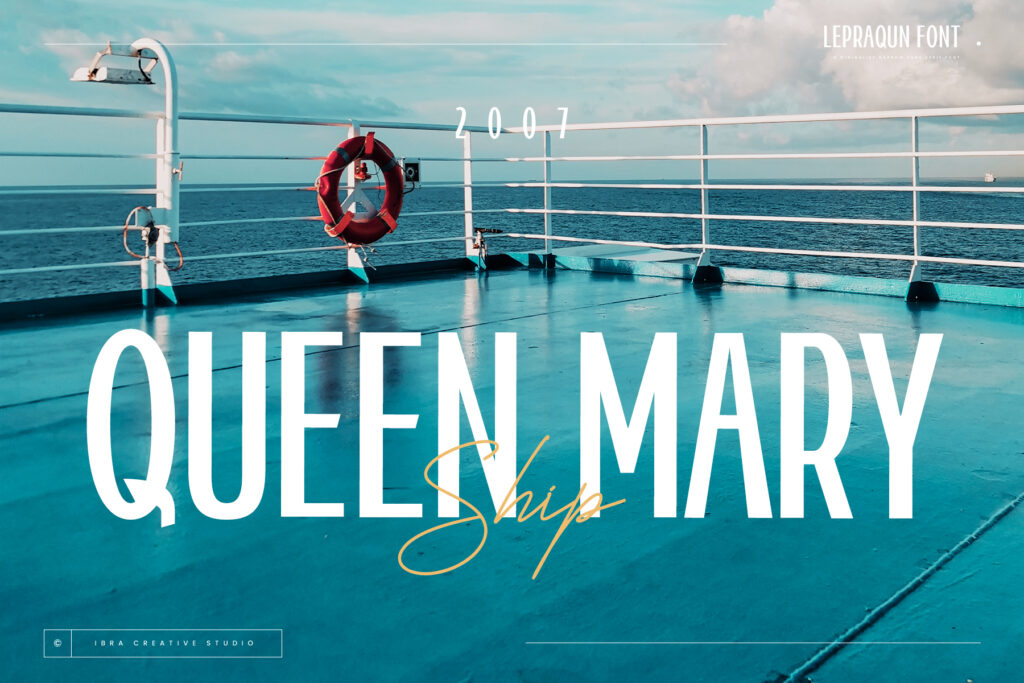
The choice of font in album art and logos isn’t just a random decision; it’s a carefully crafted strategy to connect with fans. A fun, bubbly font might evoke feelings of joy and nostalgia, while a stark, minimalist font can create an aura of mystery and sophistication.

The Psychology Behind the Fonts
Fonts Speak Louder Than Words
As they say in K-Pop, “A font is worth a thousand beats.” The right font can create a sense of identity and belonging among fans. When fans see a certain font, they don’t just read it; they feel it. It’s like wearing your favorite band’s t-shirt – it’s a statement about who you are and what you love.
Building Anticipation and Excitement
The reveal of a new font for an upcoming album or single can send fans into a frenzy of excitement. It’s the typographic equivalent of a teaser trailer – a hint of the new era that’s about to unfold.
Fun Fact and Quote
Did you know? The font used for BTS’s ‘Love Yourself’ series was so popular that it sparked a trend in fan-made merchandise. It’s like BTS not only gave us earworms but also ‘eyeworms’ – in the best way possible!
Conclusion
In K-Pop, fonts are more than just a design element; they’re a language that communicates with fans on a deeper level. Groups like Blackpink and others have shown that the right font can encapsulate the essence of the music, influence fan psychology, and strengthen the bond between the artist and the audience. So, the next time you see a K-Pop album, take a moment to appreciate the font – it’s telling you a story, one letter at a time. Remember, in the world of K-Pop, the right font can be the difference between a hit and a mega-hit.
Explore More Fonts
