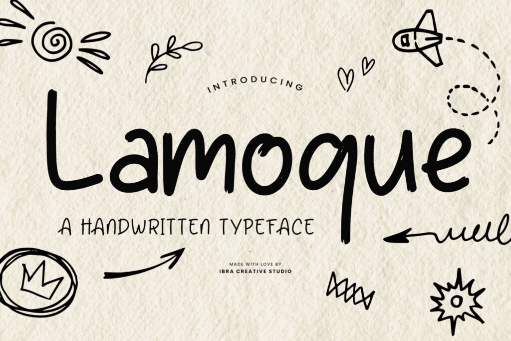
People are often surprised to hear that a font is drawn letter by letter — every capital, every small letter, every number and comma — and then tested in hundreds of combinations before anyone can buy it. Our studio in Malang has been doing this since 2019, and it still feels a little like magic when a sketch on paper becomes something you can type with.
Here is what actually happens.
1. It starts with a feeling, not a letter
Before drawing, we decide who the font is for and how it should feel. “A soft signature for beauty brands.” “A chunky font a five-year-old would love.” That one sentence settles hundreds of small decisions later.
2. Sketching the key letters
We usually begin with a handful of letters that define the personality — often a, n, o, H and a few capitals. For handwritten and brush fonts these are drawn with real pens and brushes, again and again, until the rhythm feels right. The rest of the alphabet grows from them.
3. Turning sketches into vectors
The best sketches are scanned and redrawn as clean curves in font software. This is slow, careful work: a curve that looks fine on its own can look wobbly next to its neighbours.
4. Spacing — the invisible half of a font
Ask any type designer and they’ll tell you the space between letters matters as much as the letters themselves. We set the spacing for every character and then adjust tricky pairs — like “To”, “AV” or “ry” — so words look even. It’s the part nobody notices when it’s right, and everybody notices when it’s wrong.
5. The extras that make a font feel alive
Many of our script and handwritten fonts include alternates, swashes and ligatures, so a word like “hello” doesn’t look stamped by a machine. These live in the OpenType features — you can switch them on in our type tester on any font page.
6. Testing, testing, testing
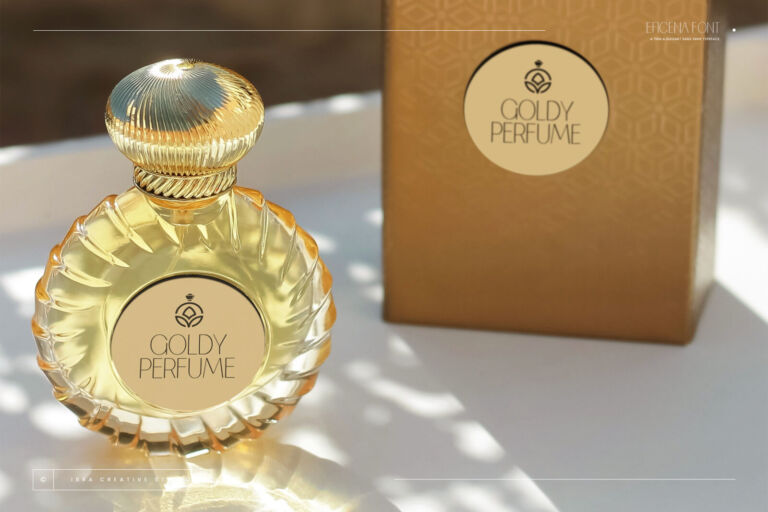
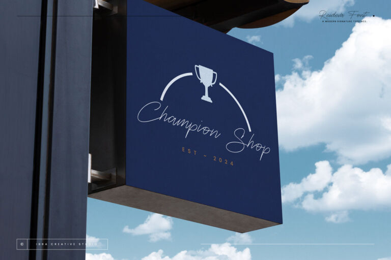
Then we use the font for real: on mock logos, posters, menus, Instagram posts, tiny labels and huge banners, in light and dark. We type names of real businesses, Indonesian and English words, and every awkward combination we can think of. Each round sends us back to fix something.
7. Release — and then it’s yours
Only then does a font get its name, its preview images and its page in the shop.
Why handmade still matters
We’re a team of more than ten designers, and over the years we’ve mentored more than a hundred young designers through our internship. What we teach every one of them is the same: a font is a tool other people will build their dreams with — a bakery’s first sign, a clinic’s first logo, a wedding invitation. That’s worth drawing carefully.
If that sounds like work you’d love, have a look at our design internship. And if you want to see the results, browse the full font library.