
Fonts for children have two jobs: they must feel fun, and they must be easy to read for young eyes. The best kids’ brands balance both.
What makes a font kid-friendly
- Rounded shapes — soft corners feel safe and friendly.
- Clear letterforms — especially “a”, “g” and “q”, which young readers learn by shape.
- Generous spacing so letters don’t blur together.
- A bit of bounce — letters that look like they’re playing.
Picks for kids and education
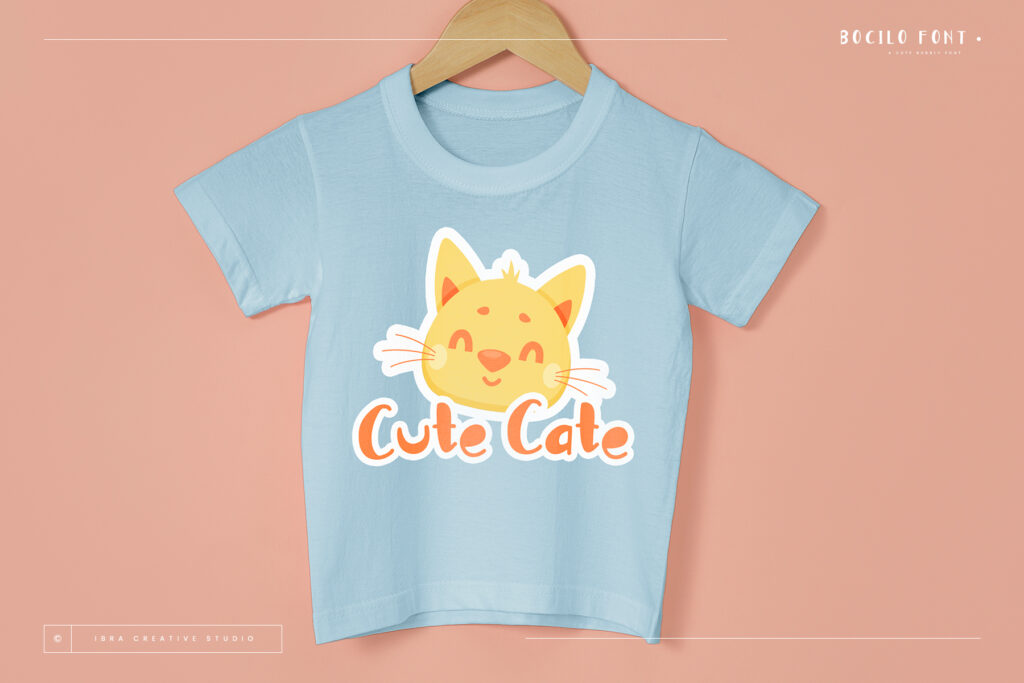
- Bocilo — bubbly and sweet for kids’ products.
- Fabelo Kids and Momain Kidz — made for children’s books and classrooms.
- Anak Kecil — quirky and playful (its name means “little kid” in Indonesian).
- Blubly Kids and Swirl Bagel — cheerful titles for toys and party invitations.
- Clevicute — a rounded sans for longer reading text.
Readable for little eyes
Children who are learning to read recognise letters by their simplest shapes. Look for a single-storey “a” and “g” (the way children write them), clear spaces between letters and no tight loops. Save the decorative fonts for titles.
-
Happy Learning
-
Happy Learning
-
Happy Learning
-
Happy Learning
-
Happy Learning
What parents and teachers look for
- Trust: playful is good, chaotic is not. One fun font plus one calm font.
- Clarity: worksheets, timetables and app buttons need a simple rounded sans.
- Warmth: soft colours and round shapes feel safe and friendly.
For apps and games
If the font goes inside a learning app or game, you need the App/Game License. Test the font at small sizes on a real phone and make sure every button label is easy to tap and read.
Practical tips
- Use the playful font for titles, and a rounded sans for anything children must read.
- Keep text large — at least 16 px on screens, bigger in early-reader books.
- For learning apps and games, you’ll need the App/Game License; printed books use the Desktop or E-Pub License.
Find more in our display and handwritten collections, or let the Font Finder suggest options for “Kids, school & toys”.