
Every December, the same thing happens to our feeds: red, green, gold glitter and a curly script that is impossible to read on a phone. Holiday design has a reputation for being tacky, but it doesn’t have to be. The brands that look best at the end of the year do something simple — they keep their usual style and add one festive touch.
That touch is very often the font. Here is how we’d pick it, and the fonts from our own library we reach for when clients ask for “Christmassy, but still us”.
First, decide which kind of festive you are
- Cosy and handmade — bakeries, cafés, craft shops, family brands. Think hot chocolate, hand-written gift tags and chalkboards.
- Elegant and sparkly — beauty, fashion, jewellery, hotels. Think champagne, ribbons and gold foil.
- Loud and playful — sales, kids’ brands, toy shops, events. Think big balloons, bright colours and “50% OFF” in letters you can see from across the street.
Pick one lane. Mixing all three is exactly how holiday design ends up looking like a crowded shop window.
Cosy and handmade
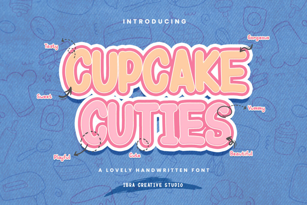
- Cupcake Cuties — round, friendly handwriting that looks like it was written on a cookie box with a felt pen. Lovely for gift tags and Christmas menus.
- Chalker Dust — a chalk texture with small irregularities, just like a café blackboard. Use it for “Today’s special: gingerbread latte”.
- Gendhisan — an old-school script with a vintage greeting-card feel. Beautiful for “Season’s Greetings” at large sizes.
Elegant and sparkly
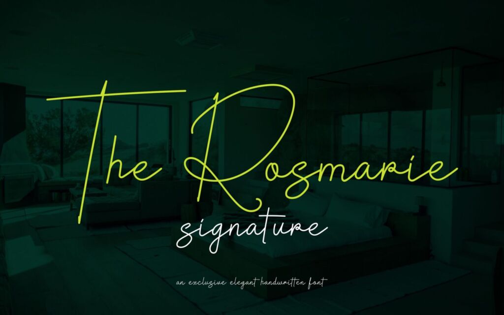
- The Rosmarie Signature — a graceful signature for “Merry Christmas” or “Happy New Year”, signed like a handwritten card.
- Opulenio — a thin, refined serif that looks expensive printed in gold. Pair it with the signature above.
- Kaliendric — a luxury serif for hampers, vouchers and New Year’s Eve dinner menus.
Loud and playful
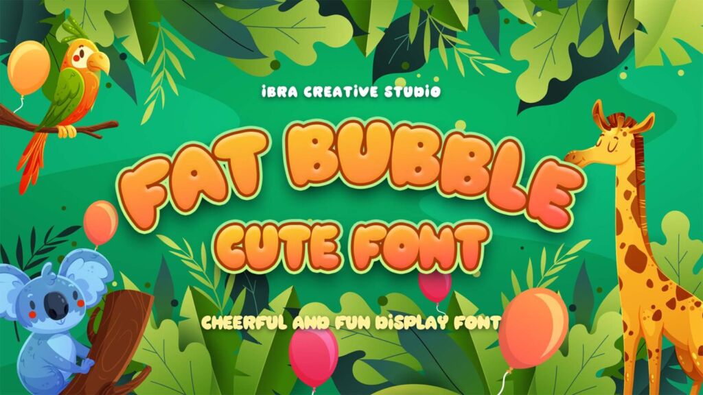
- Fat Bubble — puffy, inflated letters that look like balloons. Made for “YEAR-END SALE” banners.
- Jugglant — a vintage carnival serif with a fairground feel. Great for Christmas markets and bazaar posters.
Three combinations you can copy
- Bakery gift tag: Cupcake Cuties for the name of the treat, a plain sans for ingredients and price.
- Beauty hamper: The Rosmarie Signature for “Merry Christmas”, Opulenio in small caps for the brand and product list.
- Year-end sale post: Fat Bubble for the discount, one short line underneath in your usual brand font.
The mistake that makes holiday design look cheap
Setting everything in the festive font. A script or a bubbly display font is a spice, not the meal. Use it for three or four words — the greeting or the headline — and keep dates, prices and addresses in your normal, readable font. Your customers should still recognise you under the tinsel.
Start early, and check your license
Holiday campaigns are usually designed in November, so now is a good time to choose. If you’ll use the font on products you sell — printed gift tags, packaging, cards — the Desktop License covers up to 1,000 pieces. For a big print run or ads, check our license helper. And if you’d rather not choose alone, the Font Finder previews your brand name in fonts that match your mood.