
A house is the biggest thing most people will ever buy, so property brands have a double job: look trustworthy enough for a big decision, and stylish enough that people can imagine living there. Interior designers and architects have the same tension — expert and creative at once.
The font carries a lot of that. Type your project or studio name below:
-
Casa Verde
-
Casa Verde
-
Casa Verde
-
Casa Verde
-
Casa Verde
-
Casa Verde
What works in property and design
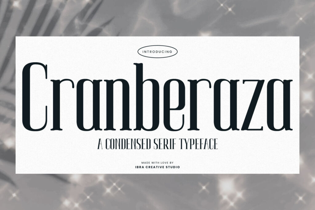
- Condensed serifs feel tall and architectural, like a building facade. Cranberaza is perfect for residence names on hoardings and brochures.
- Classic serifs like Usetoit say “we’ve been here a long time” — ideal for developers and agencies.
- Thin serifs such as Opulenio suit interior studios and furniture brands that sell taste.
- Clean sans serifs — Kunire Grotesk or the narrow Lepraqun — keep floor plans, prices and specs easy to read.
- A hand-drawn touch from Architectura feels like an architect’s annotations — lovely for sketches, social posts and studio notes.
Try it on a signboard
Casa Verde
Residences
Tips for property marketing
- Name big, details small. The project name should be readable from a passing car; the phone number from the pavement.
- Uppercase with spacing instantly feels premium for short names.
- Keep one system across hoardings, brochures, the website and Instagram — buyers see all of them.
Licensing for developers
A project or company logo needs the Logo License. Brochures and social posts are covered by the Desktop License, and the project website by the Webfont License. Big developers with many projects across Indonesia should look at the Local Brand License. The license helper makes it quick.