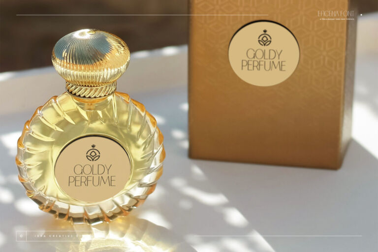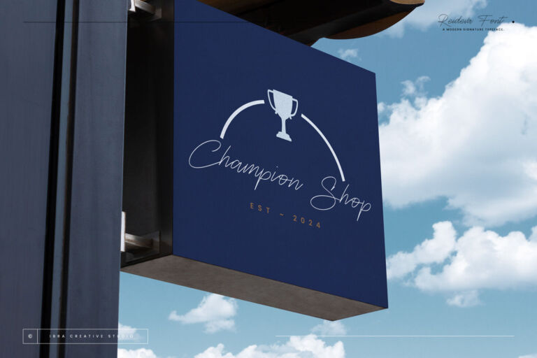

A logo is the one piece of design you’ll live with the longest. It goes on your sign, your packaging, your website, your uniforms — and changing it later is expensive and confusing for customers. So it’s worth choosing the font slowly.
Here is the process we use with clients, whether they’re opening a clinic, a coffee shop or a design agency.
Step 1: Write down three words for your brand
Before looking at a single font, describe the feeling you want. “Calm, trustworthy, modern.” “Fun, warm, local.” “Premium, feminine, refined.” Those three words will rule out most fonts instantly, which is exactly what you want.
Step 2: Choose the family
- Serif — tradition, authority, luxury. Law firms, clinics, beauty, hotels.
- Sans serif — modern, clean, efficient. Tech, startups, healthcare, retail.
- Script or signature — personal, creative, warm. Photographers, coaches, bakeries, boutiques.
- Display — bold personality. Food, events, kids’ brands, games.
Step 3: Shortlist fonts built to last
Trendy fonts are fun, but logos age best when the letters are well-proportioned and not too gimmicky. A few from our library that hold up well:
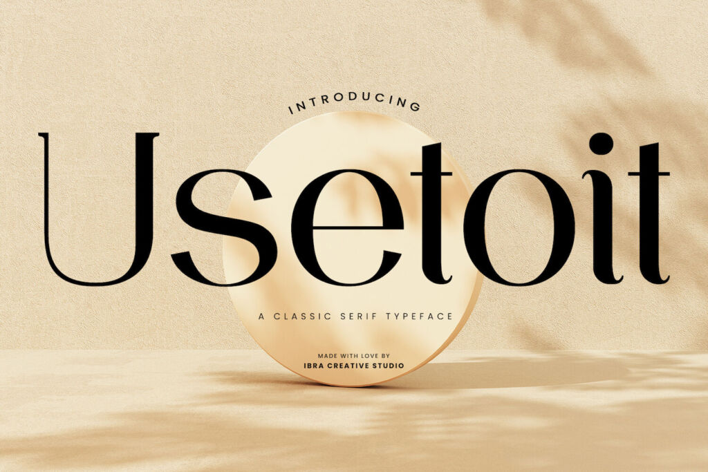
- Usetoit — a classic serif with real authority; made for logos and professional branding.
- Endaley — modern and elegant, a safe choice for beauty and lifestyle.
- Kunire Grotesk — a modern grotesk: neutral, balanced and very versatile.
- Gladeston — a clean sans designed with corporate identity in mind.
- Erakoni — heavy and confident, for brands that want presence.
- Dialeksa — a monoline signature that stays clean and legible, unlike many fussy scripts.
Step 4: Test it small, big and in black and white
- Shrink it to the size of a browser tab icon or Instagram avatar. Can you still read it?
- Blow it up to banner size. Do any letters look awkward?
- Print it in one colour. A good logo doesn’t need gradients to work.
- Type your actual business name — some fonts look great with “Sample” and odd with your real letters.
You can do the last test right on any font page with our type tester, or let the Font Finder show your name in fonts that fit your industry.
Step 5: Make it yours
The strongest logos usually start with a font and then get small adjustments: tighter spacing, a custom letter, a connected pair of characters. Even a tiny tweak makes it feel unique.
Step 6: Get the right license
A logo needs a Logo License — a Desktop License doesn’t cover logos. Planning to register a trademark? You can register your logo, but you’ll disclaim the font itself; no one can own the typeface through a trademark. Bigger company working across a whole country? Look at the Local Brand License. Our license helper makes this simple.