
Why do some brands look expensive before you see a single price? Usually it’s not the photo or the colour. It’s the serif — and, just as much, what they don’t do with it.
Luxury serifs are the most requested style in our studio, especially from beauty clinics, fashion labels and boutique hotels. These are the ten we’d shortlist, grouped by the kind of luxury you want to signal.
Fashion-magazine glamour
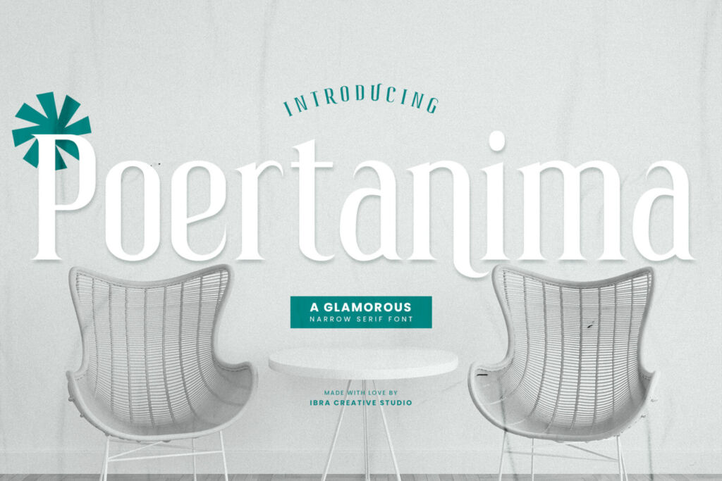
- Poertanima — a glamorous narrow serif. Tall and slender, it looks like a fashion masthead and fits long names into small spaces.
- Balmecia — a tall display serif made for big, dramatic headlines and editorial covers.
- Cranberaza — condensed and streamlined; excellent on packaging where space is tight.
Quiet, refined luxury
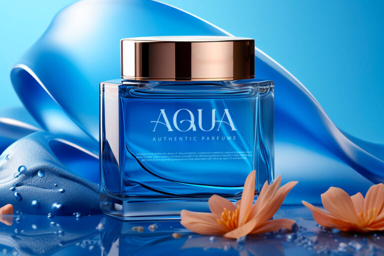
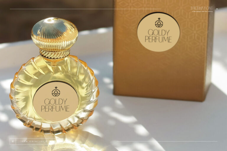
- Opulenio — thin and delicate, with elongated letterforms. Perfect for skincare, perfume and jewellery.
- Kaliendric — a balanced luxury serif that stays readable, so it works for both logos and short paragraphs.
- Borscena — classic and formal, ideal for hotels, restaurants and wedding venues.
Modern and approachable premium
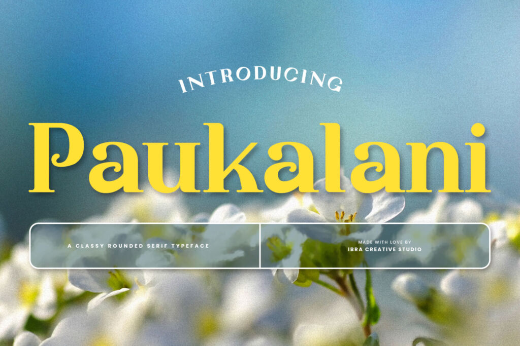
- Paukalani — a rounded serif: elegant, but softer and friendlier. Great for clinics that want to feel welcoming.
- Rishiona — stylish and contemporary, with a high-end editorial feel.
- Flicket — a modern display serif with personality, for brands that want to look premium and a little bold.
- Endaley — our go-to modern elegant serif for beauty and lifestyle brands.
Type your brand name and compare five of them side by side:
-
Maison Elara
-
Maison Elara
-
Maison Elara
-
Maison Elara
-
Maison Elara
Five tricks that make any serif look expensive
- Add space between letters. All caps with generous letter spacing is the oldest luxury trick there is — and it still works.
- Go big or go small, never medium. A huge headline next to tiny details looks confident. Everything at the same size looks like a flyer.
- Use fewer words. Premium brands say less. One line on a label beats three.
- Limit your colours. Black, white and one accent — cream, deep green or gold — is plenty.
- Pair with a thin sans. Let the serif be the star and a light sans like Eficena carry prices and details.
One last thing: test it in your real context
A serif that looks stunning in a preview can feel too thin on a small Instagram post or too fussy on a street sign. Type your brand name into the tester on any font page, or let the Font Finder show your name in our luxury matches. Using it in a logo? The Logo License covers that — see our license guide.