
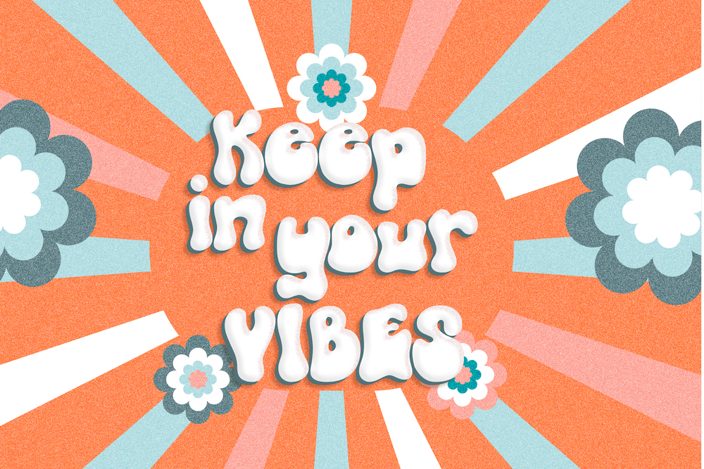
Curvy, bouncy 70s letters are back on posters, menus and merch. Retro type feels warm and nostalgic — and in a world of minimal logos, it stands out instantly.
Where retro fonts work best
- Restaurants and bars with a vintage or playful concept.
- Events and festivals — posters, tickets, wristbands.
- Merch and streetwear — T-shirts, tote bags, stickers.
- Music — covers, gig posters and visualisers.
Our retro line-up
- Funky Retrovy — bold, bubbly and full of personality.
- Retroovy Vibes — groovy curves made for posters.
- Cacophony — a vintage slab serif for menus, labels and text.
- Jugglant — carnival-style serif for show-stopping headlines.
Type your words in retro
-
Good Times
-
Good Times
-
Good Times
-
Good Times
-
Good Times
Which decade are you channelling?
- 1950s: diners, cartoons, rounded sans and script logos. Try Glerosion.
- 1970s: fat, wavy, groovy letters and warm oranges and browns. Try Funky Retrovy.
- Vintage print: slab serifs from old labels and posters. Try Cacophony.
Retro palettes that work in 2026
Mustard, burnt orange, olive, chocolate brown and cream are the classic 70s palette. For a modern twist, keep one retro colour and mix it with an off-white and a single bright accent. Add a subtle paper grain or halftone texture to sell the vintage feel without looking fake.
Put it on a shirt
Stay Groovy
Est. 1974
How to keep retro fresh, not dated
- One retro font per design. Pair it with a modern sans or a slab for the details.
- Warm colours — orange, mustard, chocolate brown, cream.
- A touch of texture — grain or halftone dots make it feel printed.
- Go big. Retro display fonts are made for headlines, not paragraphs.
Selling T-shirts or stickers? The Desktop License covers up to 1,000 pieces; above that, choose Extended. Grab all three in our Retro funk kit on the Portfolio page and save with the multi-font discount.