
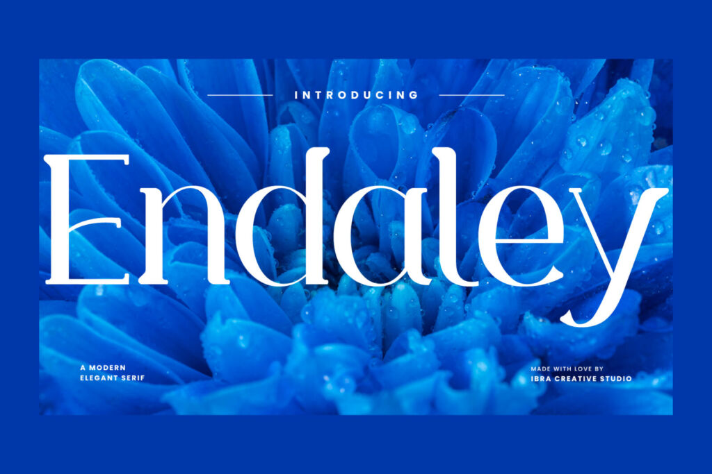
Here’s a small experiment we like to run with clients. We put their business name on screen in six different fonts and ask, without explaining anything: “Which one would you trust with your money? Which one would you take your kids to? Which one sells skincare?”
People almost always agree. Not because they know anything about typography, but because we’ve all spent our lives reading signs, labels and screens. Letters carry feelings long before they carry meaning.
Try it yourself. Type your own brand name in the box — every row updates live.
Same name, six personalities
-
Lumière
-
Lumière
-
Lumière
-
Lumière
-
Lumière
-
Lumière
Why the shapes feel the way they do
Serifs feel established
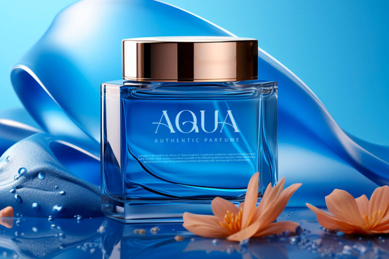
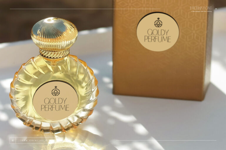
Those little feet at the ends of strokes come from centuries of printed books, newspapers and banknotes. So we read them as history, authority and quality. That’s why clinics, law firms and luxury brands lean on fonts like Endaley.
Heavy sans serifs feel confident
Thick, simple letters with no decoration say “we don’t need to explain ourselves”. Sports brands, tech companies and anyone selling energy use them. Erakoni is a good example.
Round letters feel safe
Soft corners read as gentle and kind — no sharp edges. That’s why kids’ brands, cafés and health apps love rounded fonts like Clevicute.
Handwriting feels human
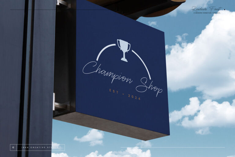
A signature looks like a person was here. Reideva makes a brand feel founder-led and personal — perfect for coaches, photographers and boutique studios.
Retro and futuristic fonts feel like a time
Groovy curves like Funky Retrovy take you to the 70s; wide geometric shapes like Galberta take you to the future. Both are powerful — and both should match what you actually sell.
See it on something real
A personality is easier to judge on an object than on a screen. Here’s a business card with a signature name and a thin sans underneath. Tap the words and change them to yours.
A five-minute exercise for your brand
- Write three words you want customers to feel. (“Calm, expert, kind.”)
- Type your name in the comparison above and pick the two rows that match those words.
- Ask three customers — not friends — which one they prefer, without explaining why.
- Choose the winner, and use it the same way everywhere for at least a year.
Still undecided? The Font Finder asks three questions about your business and shows your name in the fonts that fit.