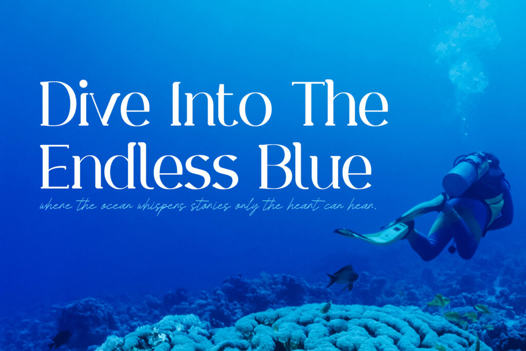
One font gives your brand a voice. Two fonts give it a conversation. The trick is contrast: pair fonts that are clearly different, but share a mood.
The golden rules
- Contrast in style, harmony in feeling. A loud display font needs a quiet partner.
- Give each font a job. One for headlines, one for reading.
- Two is plenty, three is the maximum.
7 pairings that always work
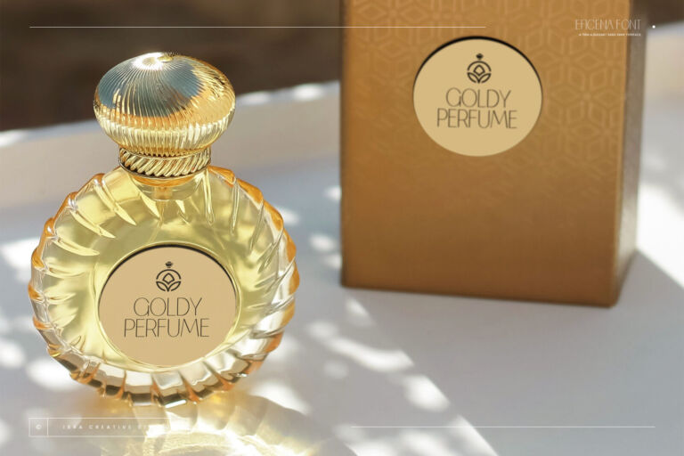
- Elegant serif + thin sans — Endaley with Eficena. Quiet luxury for beauty, fashion and hotels.
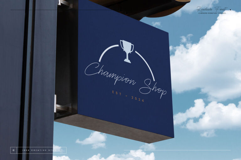
- Signature + clean sans — Reideva with Kalpatrie. Personal brands, photographers, clinics.
- Chunky display + rounded sans — Blamtami with Clevicute. Cafés, kids and pet brands.
- Retro groovy + slab serif — Funky Retrovy with Cacophony. Events, restaurants and merch.
- Marker script + bold sans — Jowarsi with Erakoni. Food, streetwear and social.
- Futuristic + neutral grotesk — Galberta with Kunire Grotesk. Tech, sport and launches.
- Calligraphic script + classic serif — Esmelora with Aluniea. Weddings and stationery.
Why pairings work (and why some don’t)
Good pairs have contrast and one shared quality. Contrast means they are clearly different — a script with a sans, a heavy display with a light text font. The shared quality is what makes them feel related: similar proportions, a similar mood, or the same era.
Pairs fail when the two fonts are almost the same (two different scripts, two similar sans serifs) or when both fight for attention (two decorative display fonts).
Test a pairing live
The hierarchy rule
Decide which font is the hero before you start. The hero gets the brand name and big headlines; the partner gets everything else. If you can’t tell which one is the hero by looking at a page, the pairing is too even — make one bigger, bolder or more decorative.
Pairing checklist
- Is one font clearly the hero?
- Can you read the partner font at 12 px on a phone?
- Do they share a mood (luxury, playful, vintage, techy)?
- Do you only need two — or three at most?
See the pair before you buy
Every font page now has a “Pairs well with” section that shows the font as a headline with its partner underneath. And buying two or more fonts together gives you an automatic multi-font discount in the cart.