
Before a player reads a single line of your story, they read your title screen. The font on that screen tells them what kind of game they’re about to play — cosy or competitive, retro or futuristic, magical or brutal. Get it wrong and a horror game feels like a puzzle app.
We draw a lot of display fonts, and gaming is one of the places where a strong personality actually pays off. Here is how we’d match a typeface to a genre.
Match the font to the genre
Retro and indie: go pixel
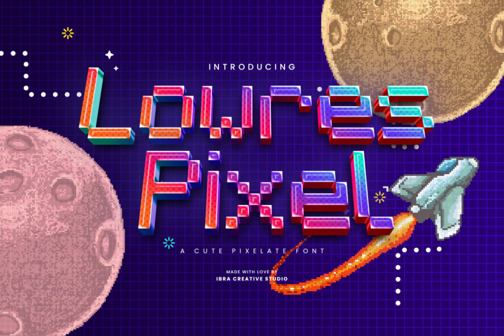
Pixel fonts instantly say “arcade”, “8-bit” and “made with love by a small team”. Lowres Pixel is a cute, chunky pixel face that works for titles, scores and menus. Pixelate leans a little more techno — nice for HUD labels and countdowns.
Sci-fi, racing and esports: go futuristic
Wide shapes, sharp cuts and geometric lines feel fast and high-tech. Strateen is a clean futurism sans that reads well on team jerseys and overlays. Loominaire and Galberta are more dramatic — save them for logos and title cards. For something stranger, Alagereas is a sci-fi serif, which is rare and memorable.
Action and fighting: go brush
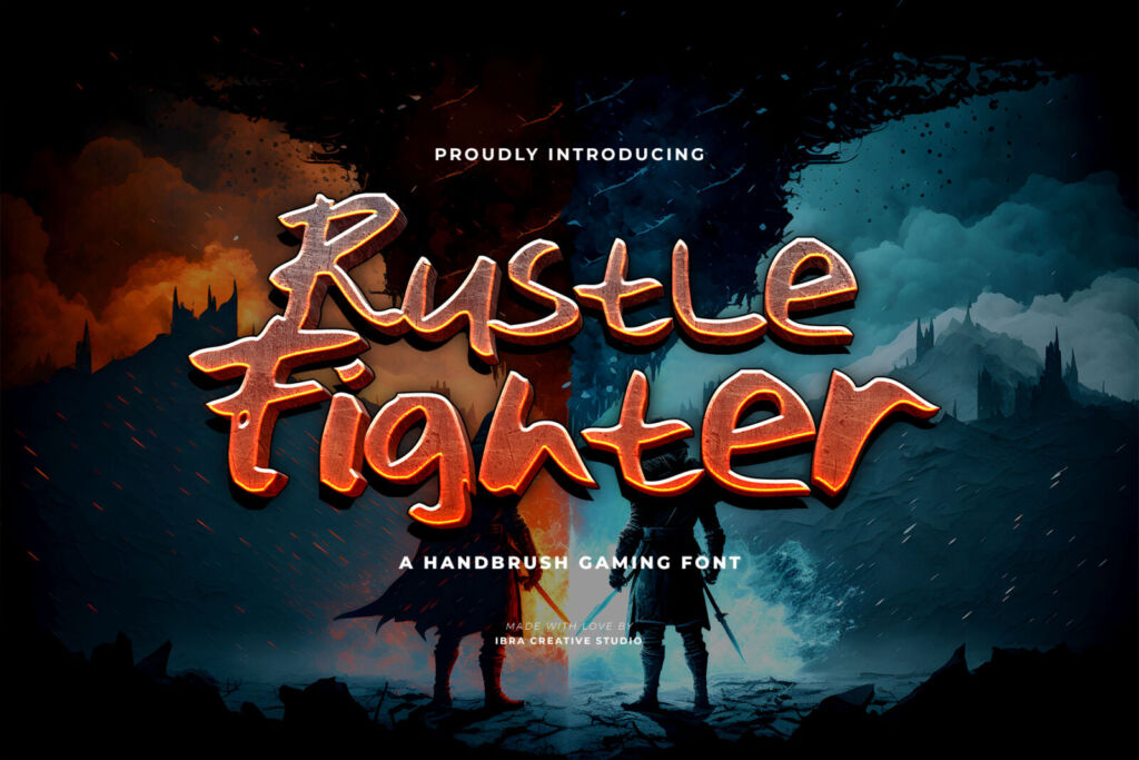
Rough, fast brush strokes feel like motion and impact. Rustle Fighter was literally drawn for this: punchy, energetic and perfect for “ROUND 1” or a tournament poster.
Fantasy and adventure: go mystical
Cracked Dream has the otherworldly, slightly broken look that suits RPGs, dungeon crawlers and fantasy streams.
Casual and mobile: go round and friendly
Puzzle and casual games want letters that look soft and safe to tap. Chunky and Lagoona Boo are bubbly without being childish.
Title font vs. interface font
Here is the rule that saves most indie games: a display font for the title, a plain font for everything else. Menus, dialogue and settings need to be read quickly, on small screens, sometimes in the middle of a fight. A characterful font is perfect for your logo and big headlines; use a simple sans for the UI so players never squint.
For esports teams and streamers
- Test your logo font at tiny sizes — it will appear as a 40-pixel avatar more often than on a big screen.
- Pick heavy weights for overlays; thin lines disappear in compressed streams.
- Use the same font on jerseys, thumbnails and overlays so viewers recognise you instantly.
Which license do you need?
If the font is inside the game or app, choose the App/Game License. Monetized streams, YouTube videos and TikToks need the Monetized License, and a team logo needs the Logo License. Our license helper sorts it out in two questions.